+44 753 718 3990
 hello@devmontdigital.io

To new businesses, give you the expertise, approaches, and techniques you should know to be a super hero.
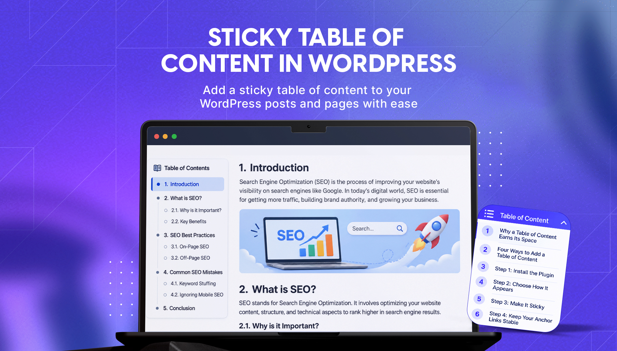
A reader opens your 2,000-word guide looking for one answer. They scroll, lose their place, scroll back up, and leave. Long posts only work when readers can jump to the part they came for, and WordPress does not ship a table of contents that does that.
This guide shows three ways to add a sticky table of contents to a WordPress post: automatically, with a block, or with a shortcode. It also covers the details that usually go wrong, such as sticky headers covering headings, anchor links that break when you edit, and tables of contents that stay empty.
A table of contents does two jobs. For readers, it turns a long post into something they can scan and jump through, and a sticky version keeps that navigation in view while they read. For search engines, it gives every section a clean anchor link.
Google has said it can generate “jump to” links in search results algorithmically from page structure, and its advice for improving the chances is to organize long pages into distinct sections, give each an anchor with a descriptive name, and include a table of contents that links to those anchors. Google’s guidance is older, and the links only show up for some queries, so treat them as a possible bonus, not a promise. A table of contents is not a ranking factor on its own. Its value is reader experience and clean page structure.
We built Devmont TOC Navigator for this, one of our free WordPress plugins. It requires WordPress 5.8 or higher and PHP 8.0 or higher. First, how the options compare.
| Approach | Effort | Sticky option | Best for |
|---|---|---|---|
| Manual anchor links | High, and breaks on every edit | No | One short page |
| Auto-insert (plugin setting) | Lowest | Yes | A blog where every long post should have one |
| Block in the editor | Low | Yes | Choosing where it sits, post by post |
| Shortcode | Low | Yes | Page templates, widgets, and classic editor content |
Pick auto-insert for consistency, the block when you want control over placement, and the shortcode when you work outside the block editor. Manual anchors are fine for a single page you will never change.
Go to Plugins, then Add New, search for Devmont TOC Navigator, then click Install and Activate. Open its settings page to choose your defaults, including heading levels, title text, and styling.
Auto-insert. Switch on the auto-insert setting and the plugin places a table of contents at the top of your content for the post types you select. Posts and pages are the defaults. To turn it off for a single post, use the plugin’s checkbox on that post’s edit screen.
Block. In the editor, add the Smart TOC block where you want the list. Its options mirror the shortcode, and it only renders on single posts and pages.
Shortcode. Paste this wherever shortcodes work:
Three options control the output:
| Option | Values | Default |
|---|---|---|
| heading_levels | Any of h1 to h6, comma separated | h2,h3 |
| float | none, left, right | none |
| toc_sticky | yes, no | no |
A sticky, right-aligned list that includes H4 headings looks like this:
Stick with H2 and H3 for most posts. Add H4 only when sections are long enough that readers need the extra step, since a table of contents that runs past a screen defeats its purpose.
The plugin highlights the active section as the reader scrolls and accounts for the height of a sticky list when it scrolls to a heading. Two problems remain that the plugin cannot see.
A sticky theme header can cover the heading. When a reader clicks a link, the browser scrolls the heading to the very top of the screen, right under a fixed header. If your theme has one, add a scroll margin so headings land below it:
Set the value to your header’s height plus a little breathing room. Test it after adding it, because a JavaScript-driven scroll that already adds its own offset can double the gap.
A sticky list can crowd a phone screen. A floating box that is fine on a desktop can cover a quarter of a phone. Use the collapsible header so readers can fold the list away, and test on a real phone. Our mobile interface design guide covers sticky elements, tap targets, and layouts that hold up on small screens.
When a heading has no ID, the plugin creates one from the heading text plus a number based on its position in the post, such as before-you-start-0. If you later add or reorder headings, those numbers can shift, and any link you shared to a specific section may no longer land in the right place.
For headings you link to from other pages or from an email, set your own anchor in the block editor under the heading’s Advanced settings, in the HTML anchor field. The plugin keeps IDs that already exist. Use a short, descriptive name such as sticky-options, not “section-2”.
The table of contents is built from the headings saved in the post’s content. That works for standard posts written in the block or classic editor. Test pages made with a page builder, because headings added by a builder or a theme template may live outside the post content and not appear in the list.
Two habits make the output better. Use one H1 per page, which is your title, and let the list start at H2. And write headings that tell the reader what they will find, since the heading text becomes the link text. A guide like our WordPress features to disable post, with a verdict under each heading, shows why: a reader who wants to know whether XML-RPC is safe can jump straight to it. The same applies to a decision-heavy comparison such as Laravel vs WordPress, where readers want the section that matches their project.
The settings page lets you style the list without code. You can change the header’s colors, font size, padding, and border, the link colors for normal, hover, and active states, and the container’s background, border, width, margins, corner radius, and shadow. The header toggle uses a semantic button with ARIA attributes, so keyboard and screen reader users can fold the list open and closed.
If you want help matching a table of contents to a design system or building one for a custom theme, that is part of our WordPress development work.

Content Manager at Devmont Digital
You hand a client a finished website. The design is theirs, the copy is theirs, and then they open wp-login.php for the first time and see the WordPress logo. Click it and it opens wordpress.org. To a client who just paid for a custom brand, that looks like unfinished work, and it is the page their whole team sees every day.
Read moreYou publish on Medium, but your own website shows none of it. A visitor who lands on your homepage has no idea you write at all, and the stories you spent hours on sit on someone else’s domain. Linking to them by hand works for a week. Then you publish again and the page is out of date.
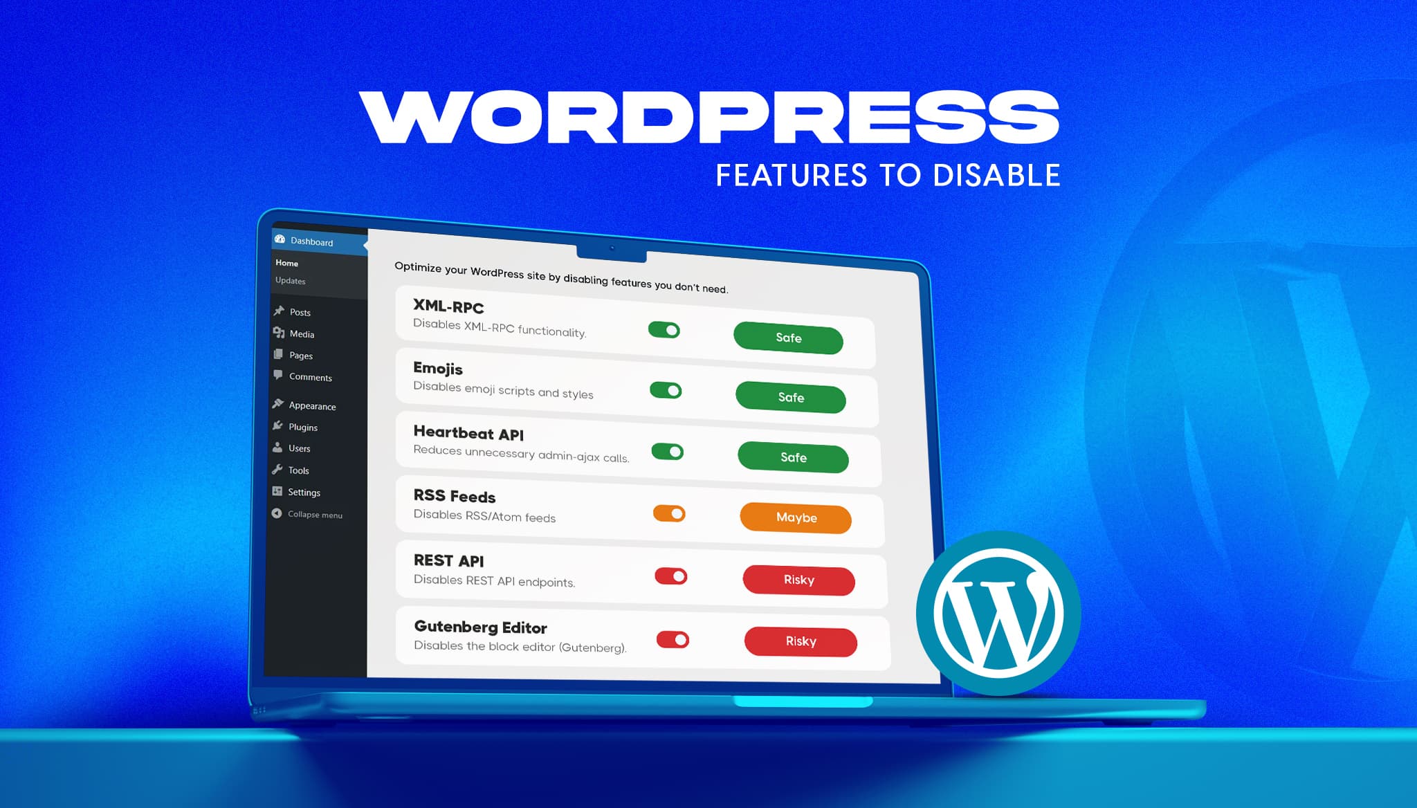
Read moreA fresh WordPress install ships with features most business sites never use. Some add background requests, one opens a well-known login attack path, and a few load code on every page for a nice-to-have. The usual advice online is to switch them all off. That advice breaks sites. This guide gives a verdict on the […]
Read more