 +44 753 718 3990
  hello@devmontdigital.io
To new businesses, give you the expertise, approaches, and techniques you should know to be a super hero.
Banner ads are everywhere. You’ll spot them at the top of websites, tucked into blog sidebars, or floating across news articles. They’re a common way to grab someone’s attention and drive clicks, but their impact really depends on how well they’re made. A strong banner ad can draw people in. A clunky and hard-to-read one will just get ignored.
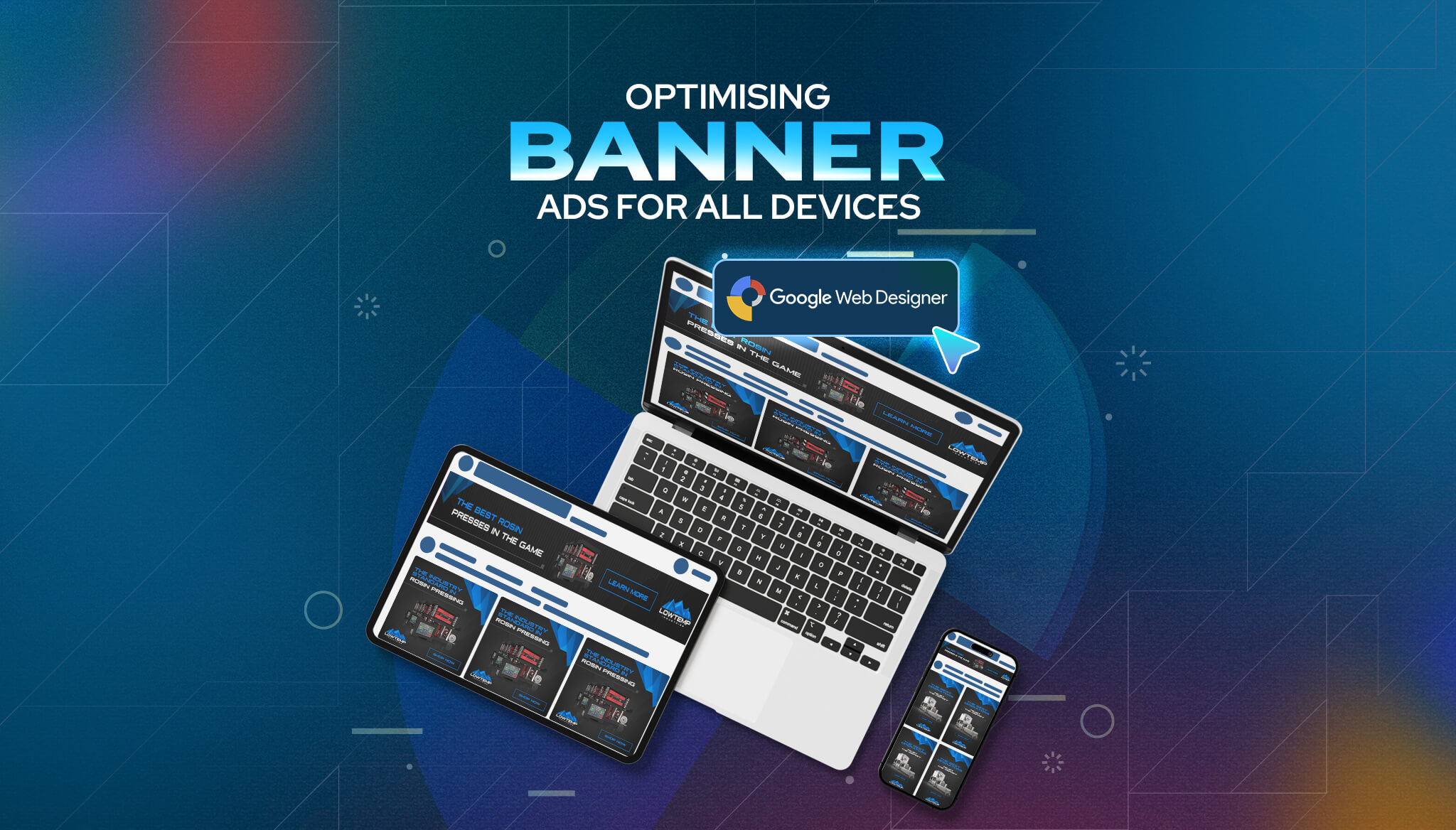
One of the biggest challenges when designing banner ads is making sure they look right on all devices. A crisp, well-spaced ad on your laptop might be completely unreadable on your phone. That’s where tools like Google Web Designer make a big difference. It’s built to help you design flexible, responsive ads that shift and resize automatically, depending on the screen they’re viewed on.
When it comes to building banners that work across screens, it helps to start by understanding standard ad dimensions. Banner sizes vary depending on whether someone is browsing on a computer, tablet, or mobile phone. A design that works well for one platform can appear stretched, squished, or cropped on another if it’s not made right.
Here are a few common banner ad sizes worth knowing:
It’s not just about size, though. Placement matters too. A banner placed near the top of a page can work well on desktop but might squeeze the main content on mobile. Some platforms support adaptive banners that automatically try to fit themselves, but they often still need a helping hand from the designer to look just right.
The safest bet is to design with flexibility in mind. This means creating versions that are tailored for each main screen size and making sure fonts, graphics, and buttons don’t shrink to unreadable levels. A solid strategy involves setting priority content that stays visible and cutting unnecessary visual clutter that won’t translate well on small screens.
Sometimes it’s helpful to think about it like packing a suitcase. You’ve only got a limited amount of space, so you want to make sure everything fits, looks nice, and makes sense once you get to your destination. If something doesn’t fit, it gets left behind or replaced with something better suited for the trip.
Designing banner ads by hand for every screen size can get tricky fast. That’s where tools like Google Web Designer come in handy. It’s built for this kind of work and gives you what you need to plan out responsive, animated banners that adjust across screen types.
Here’s how to get started:
When making responsive ads, it’s smart to test across devices. Check your ad on desktop, tablets, and multiple phone sizes. If your call-to-action button drops below the frame on one size or the logo becomes unreadable, it’s time to tweak the layout.
The design process takes some trial and error, but the goal stays the same: clear, easy-to-read ads that look great wherever someone might see them. Keep designs simple, make text large enough to read on small screens, and focus on one strong message per ad. That alone can make a big difference in how people react to what you’re showing them.
Attractive design means very little if the ad takes forever to load. The quicker your banner ad appears, the more likely someone’s going to notice it. That’s why file size matters. Large files slow things down, especially for mobile users, so keeping them small is a big win. Compress images before uploading and avoid heavy animation if it’s not really needed.
Make sure your design doesn’t feel crammed. Clean, focused banners with clear messaging perform better than ones trying to do too much. It helps to stick to a single focal point—maybe a product, slogan, or offer—and let it shine through. You’ve got limited space, so clarity matters.
Here are some tips to help make sure your banner ads look good and are easy to engage with:
It’s also smart to run A/B tests. Try out two or more banner versions with different layouts or copy to see which one gets better results. Even small changes—like the size of a button or a background colour—can make a difference. This kind of testing gives clues on what your audience connects with and helps you fine-tune future designs. Think of it like tuning up a car. Every little adjustment helps it run more smoothly.
Design tools and tips are helpful, but putting everything together still takes a trained eye. Even small errors in layout, sizing, or text placement can hurt how the ad performs. That’s where professional support becomes valuable. A skilled team brings a broader view. They don’t just look at one ad, they build campaigns that stay consistent across all channels and devices.
When experienced designers are working on your banner ads, you get more than attractive colours and catchy headlines. They pay close attention to how people interact, where they click, what grabs attention, and when they scroll away. All this helps create better-performing ads.
Working with a team also means saving time. Instead of learning everything from scratch and testing random fixes, you hand it off to someone who’s been through it before. It’s a more efficient way to reach your goals, especially if you’re handling several campaigns at once.
Good design is a balance. Ads need to look good and work properly—the right size, right layout, tested to load quickly, and designed to keep people engaged. While templates and software help, it’s the human touch that often makes the real difference.
Responsive banner ads aren’t a nice bonus anymore. They’re required. With people switching between phones, tablets, and desktops all day long, your ads need to be just as flexible. If your banner can adjust to fit every screen, your message stays clear and attractive no matter where people are browsing.
You don’t need fancy graphics or huge budgets. Good design starts with knowing the space you’re working with, writing short and sharp copy, and testing layouts that feel right on both small and big screens. Tools like Google Web Designer make the process smoother, but knowing when to simplify or tweak things is just as important.
When your banners are easy to understand, quick to load, and properly sized, results improve. You’ll get fewer wasted clicks and better engagement. Clear layout, strong messages, and simple visuals tend to win more attention.
For businesses that want to avoid guesswork and get things right faster, working with a creative team that understands all the moving parts can make a big difference. Whether you’re running a promotion or launching something new, well-designed banners can help turn views into action.
Ready to enhance your advertising efforts with expert insights? Explore how Devmont Digital can offer tailored solutions to optimise your banner campaigns effectively. By focusing on best practices and smart design choices, your ads will stand out and engage audiences across all devices. Dive into our expert advice on google web designer banner ads to learn more about how you can elevate your advertising strategy today.
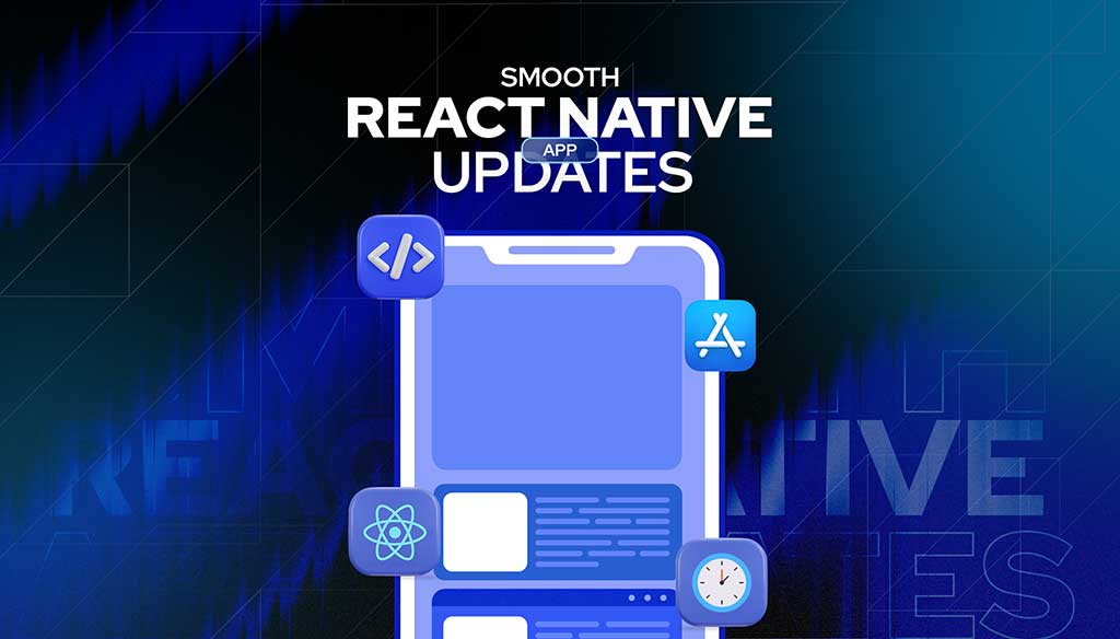
Keeping an app fresh and running smoothly means updates are part of the regular routine.
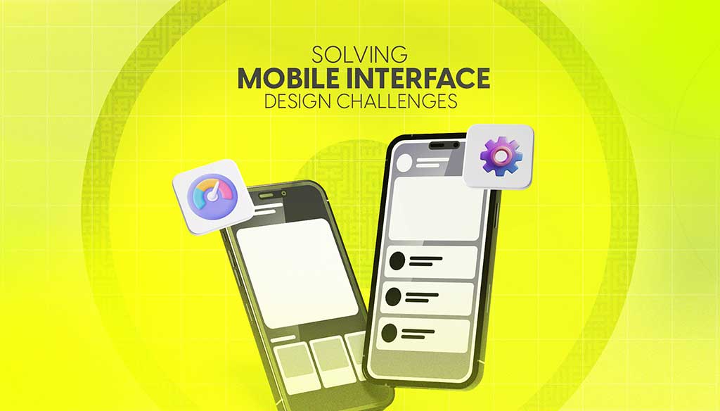
Read moreDesigning for mobile isn’t just about shrinking everything down to fit a smaller screen. It’s about making sure users can move through an app or website with ease, no matter where they are or what device they’re using.
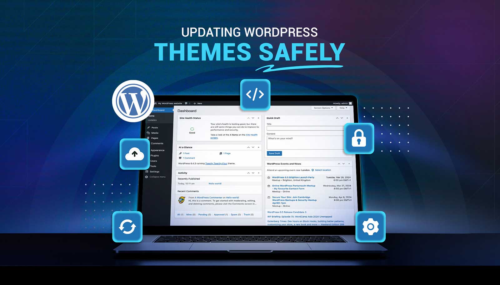
Read moreUpdating a WordPress theme sounds simple, but there’s always that worry it might break something on your site. Whether it's a misaligned button, a missing image, or a full layout shift, one small change can ripple into major issues. That’s why it’s so important to handle theme updates with care. Updates bring new features and repairs, but your site’s performance, design, and layout should stay just as your visitors expect or get even better.
Read more