To new businesses, give you the expertise, approaches, and techniques you should know to be a super hero.
A well-designed banner ad can be the difference between a skipped ad and a click-through. When people scroll fast, you have just seconds to grab their attention. That’s where smart
banner design comes in. It’s not just about pretty graphics. It’s about building an ad that connects, makes sense right away, and encourages someone to take action. Good design guides the eye, highlights what matters most, and leaves a clear message behind.
Think of banner design like a good road sign. It should be easy to spot, quick to understand, and point you in the right direction. A strong banner helps your ad stand out among all the noise
online. That means more views, more interest, and more results. But to get there, it takes more than sticking your logo on an image. It takes strategy.
Before diving into colours and fonts, it helps to lay out what makes up a quality Google Ads banner. These banners come in a variety of sizes and styles, but they all follow the same basic structure: headline, supporting text, call to action, and visuals. Each part plays a specific role in guiding the viewer’s attention.
Here are the core elements:
The power of a banner lies in how well these parts work together. If the headline says one thing but the visual suggests something else, the ad becomes confusing. If the design is too cluttered, people will scroll past. If it’s too plain, it might never catch attention at all. Even the most well-written headline won’t perform if it’s placed on a poor background or overshadowed by too many extra graphics.
A good example would be a banner promoting a summer sale on travel gear. The headline might read “Pack Light, Travel Far,” paired with a clean image of a suitcase on the beach. A quick line of text could say “Up to 40% off selected items,” followed by a bold button that reads “Shop Now.” It’s clear, themed, and drives action without trying to fit every product on the screen.
Keep in mind, banners aren’t just viewed on big laptop screens. They show up on phones, tablets, and other small screens too. That’s why simplicity counts. Every pixel matters. A clear message and balanced layout can help you connect with more eyes and get better results from your ad spend.
A banner that performs well doesn’t happen by chance. It’s built around some clear design principles that help users understand what the ad is offering and why they should care. One of the biggest pieces is visual hierarchy. This means making sure the most important information stands out first. Think of it like stacking blocks. The headline should come at the top, then the supporting text, and finally the call to action.
While layout matters, colour plays a big role too. You don’t need to go wild with the colour palette. Actually, sticking with brand colours and using contrast wisely tends to work better. A strong background colour with white or black text often packs more punch than a rainbow of competing colours. Typography also affects how long people spend looking at a banner. If it’s hard to read or uses five different fonts, it can slow people down or confuse them.
Images should match the tone and feel of the ad. And they have to load fast. High-quality, relevant visuals give the ad a professional look and help send the message quicker than copy alone. It also helps when the imagery matches the branding that someone might see on a website, social page or product package. Keeping things consistent builds trust.
One thing to avoid is clutter. Just because there’s room in a banner doesn’t mean it needs to be filled. White space makes your message easier to read and keeps the focus on what matters. The hierarchy of the elements, the balance of colour, and the strength of messaging all need to work together to keep the viewer moving in one direction, towards the click.
Once your design follows the basics, it’s time to start thinking about performance tweaks. These are simple changes or habits that can have a significant effect on how well your banner ads convert. Here are a few to keep in mind:
For example, if you’re running a banner campaign for a new workout programme, you might test “Start Training Today” against “Join The Challenge.” One might perform better than the other depending on the placement or audience. Keep the visual backdrop the same so you can focus on just the message difference. Over time, this approach gives you more data on what sparks action.
And don’t forget timing. Align banners with promotions, seasons or known events that matter to your customer. This can give your ad relevance and boost clicks just by being timely and familiar.
Even well-trained designers can slip up. While one off-brand colour or typo might not destroy a campaign, repeated design issues can pull your results down fast. Some mistakes are pretty
common and worth avoiding from the start.
It’s also common to get too clever with the message. Viewers shouldn’t have to puzzle through a tagline. Aim for clarity first. If the ad feels confusing or takes too long to figure out, it’s not going to get clicks. Simple, well-targeted creativity speaks louder than over-designed fluff.
Good banner design isn’t just about looks. It’s about making sure every part of the ad works hard to capture attention and trigger action. A smart layout, clear hierarchy, and good use of brand assets build trust. A strong call to action moves the viewer forward. Paired together, these create an ad that doesn’t just look good, it performs.
When you tune your banners with care, the payoff shows up quickly. Better engagement. More clicks. Lower ad costs. But it’s a process that takes planning and skill. Choosing the right message, testing tweaks, and sticking to brand rules all add up to smooth, effective campaigns.
Bringing all this together means you’re not guessing anymore, you’re designing with purpose. Every part of your banner can pull its weight when the layout, message, and visuals support each other. That’s how small tweaks lead to bigger results in the long run. Nothing beats having a thought-out system that works, scales, and keeps growing with your goals.
Boost your brand’s impact and create effective ads with ease. Learn more about crafting top-notch google ads banner design with Devmont Digital’s design expertise. Transform your ideas into engaging ads that compel and convert. Let’s optimise your ad strategies today!
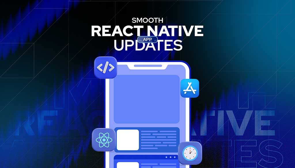
Keeping an app fresh and running smoothly means updates are part of the regular routine.
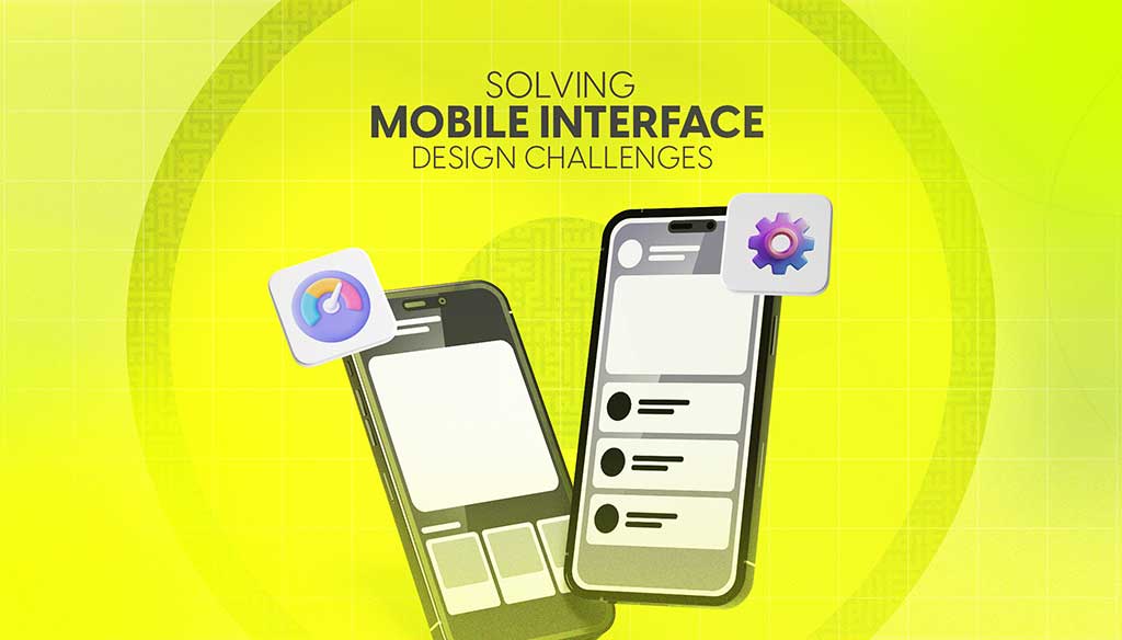
Read moreDesigning for mobile isn’t just about shrinking everything down to fit a smaller screen. It’s about making sure users can move through an app or website with ease, no matter where they are or what device they’re using.
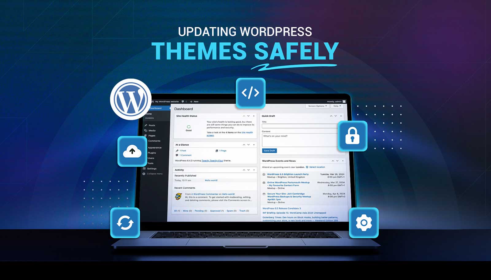
Read moreUpdating a WordPress theme sounds simple, but there’s always that worry it might break something on your site. Whether it's a misaligned button, a missing image, or a full layout shift, one small change can ripple into major issues. That’s why it’s so important to handle theme updates with care. Updates bring new features and repairs, but your site’s performance, design, and layout should stay just as your visitors expect or get even better.
Read more