To new businesses, give you the expertise, approaches, and techniques you should know to be a super hero.
When people recognise a brand just by its colours, shapes, or layout, that’s visual recognition at work. It’s more than just a logo on a product or a name on a website. It’s about how your brand feels the moment someone sees it. Design elements trigger memories, emotions, and associations that can build trust much faster than words ever could.
Consistency plays a big part here. Using the same design elements across all platforms helps people remember your brand more quickly. From ads and packaging to your homepage and social media, everything should connect visually. The stronger the flow, the easier it is for your audience to recognise you straight away. That familiarity keeps you top of mind and helps shape how people feel about what you do.
Colour is often the first thing people notice when they interact with a brand. It’s not just a pretty touch. Certain colours can nudge people towards particular moods or reactions. A bright tone might feel fun and light. A darker shade might feel calmer or more professional. That quick, split-second impression shapes expectations before a single word is read.
When planning your brand’s look, it helps to pick a colour palette that matches your voice and values. These colours then become part of a visual pattern that audiences use to recognise you. The goal isn’t to be trend-focused but to find what feels true to your brand and is easy to apply across materials.
Here’s how to approach colour use more strategically:
Think of brands like IKEA. The blue and yellow aren’t just colours—they’ve become part of the brand’s public image. Even if the logo’s not visible, the palette alone might tip you off to its
identity. That’s the kind of association you want to aim for. Pick something that reflects who you are, and use it with consistency.
When done with care, colour builds deeper ties with your audience. Over time, those colours become more than visual choices. They’re cues that signal who you are and what you stand for.
Fonts do more than display words. They carry tone. A light, round typeface might feel playful and relaxed. A tight, sharp font can feel structured and clean. That’s why font choices matter
just as much as logos or images when shaping how your brand is perceived.
Fonts help turn basic information into branded experiences. Whether it’s a product label or a homepage sentence, typography tells the reader what kind of brand they’re interacting with
even before they finish reading.
Here are a few points to keep in mind when choosing typography:
Typography bridges the gap between branding and communication. It guides users through your content without making them feel lost or overwhelmed. When chosen well, type adds polish
and a sense of identity. It turns simple words into something recognisable, familiar, and impactful.
Strong visuals go beyond decoration. They tell stories, express emotion, and frame your brand without needing a single word. When someone scrolls through your website or flips past your ad, the imagery should speak right away. Whether it’s through photos, illustrations, or icons, your visuals play a big part in shaping what people think and remember.
An image that connects with your message can boost trust, make the content easier to follow, and keep people engaged longer. But visuals need to be used on purpose, not just added because there’s space to fill. They should match your tone, support your message, and feel like they belong. Whether you’re going for sleek and modern or warm and casual, the visuals you choose help shape that voice.
Here are a few ways to use images and graphics more intentionally:
Think of a café that always shares warm, softly lit shots of its drinks and space. Over time, people start to link the smooth, cosy look with its name. Even if they scroll past quickly, the
feeling of familiarity might bring them back. That’s the value of image consistency across everything you post or print.
High-quality visuals help build trust and come across as more professional, but they’re also just easier for people to connect with. If your design feels disjointed, that can throw people off. But when it’s cohesive, users stay longer, remember more, and are more likely to feel something positive about what you offer.
A great brand look isn’t about having the flashiest colours or fonts. It’s about bringing visual parts together in a way that feels steady and clear across everything you share. From your website and social posts to packaging and ads, the design should carry the same look and voice. That consistency is what helps your brand stand out and stay remembered.
When each design piece matches, recognition grows stronger. It becomes easier for your audience to spot your content, even in a busy feed or crowded shelf. You’re shaping a space where your audience knows what to expect. That comfort keeps them coming back.
Here are some simple tips to build a more unified visual identity:
This is where a brand identity design agency can really help. They know how to bring together all those parts like typography, colours, images, and layout, and lay it out into a repeatable system. The result is a brand look that you don’t have to rebuild from scratch each time.
A cohesive design doesn’t mean every piece must look the same. It means they feel like they belong to the same family. That sort of structure holds everything together, even as you grow or launch new products. It’s the glue that keeps your brand recognisable without forcing it to be stiff.
Visual identity is more than piecing together a website layout or choosing a decent logo. It’s how every part of your content gives people an impression of who you are. Colours, fonts, images, and layout all come together to build that sense of trust and memory. People remember what they can recognise easily. The better your brand is at keeping things visually steady, the longer
you stick in their minds.
Design should work like a silent introduction. Before your audience even reads a word, your visuals should create a mood that draws them in. Done well, they also build trust, make your brand feel familiar, and even trigger those good past experiences people connect with your product or service.
Design isn’t something you set up once and then forget. It should adjust and grow with your brand. Whether you’re fresh on the scene or updating your style to match where you’re going next, working with someone who knows how the pieces fit makes a big difference. The right design choices work behind the scenes every time your audience sees your brand, even if they
don’t realise it.
Ready to bring your brand identity to life with cohesive design? Learn how a professional brand identity design agency can help create a unified look that resonates. At Devmont Digital, we specialise in crafting visuals that build recognition and trust. Reach out to find out how we can help shape your brand’s unique story.
Keeping an app fresh and running smoothly means updates are part of the regular routine.
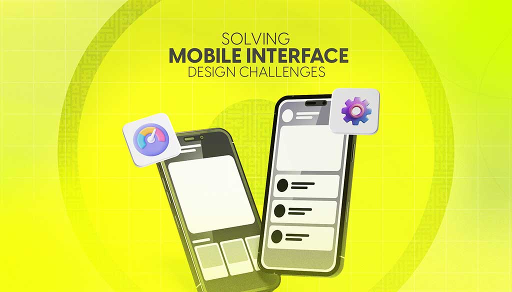
Read moreDesigning for mobile isn’t just about shrinking everything down to fit a smaller screen. It’s about making sure users can move through an app or website with ease, no matter where they are or what device they’re using.
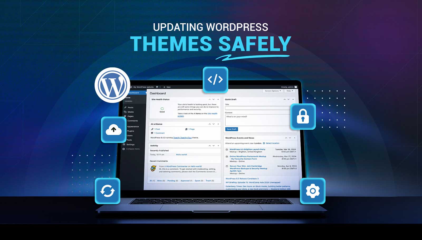
Read moreUpdating a WordPress theme sounds simple, but there’s always that worry it might break something on your site. Whether it's a misaligned button, a missing image, or a full layout shift, one small change can ripple into major issues. That’s why it’s so important to handle theme updates with care. Updates bring new features and repairs, but your site’s performance, design, and layout should stay just as your visitors expect or get even better.
Read more