 +44 753 718 3990
  hello@devmontdigital.io
Design
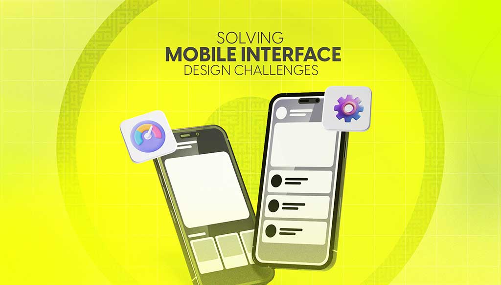
Designing for mobile isn’t just about shrinking everything down to fit a smaller screen. It’s about making sure users can move through an app or website with ease, no matter where they are or what device they’re using.
Read more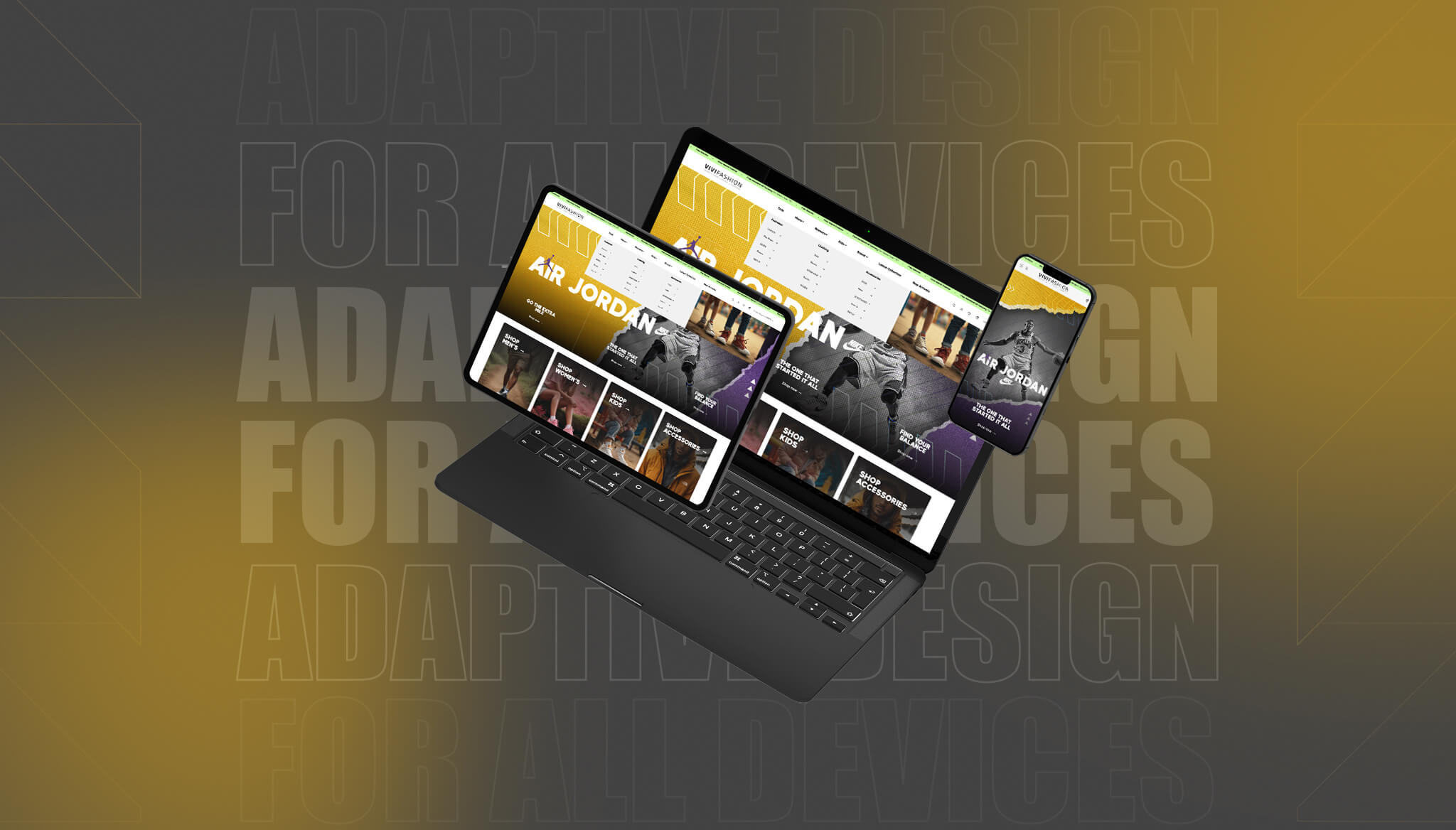
Introduction Screens come in all shapes and sizes now. From big office monitors to slim smartphones and tablets, people switch between devices without giving it much thought. That means your website has to do the hard work, adjusting smoothly, loading quickly, and looking right, no matter what screen it’s on. If it doesn’t, users might […]
Read more
When people visit a website, they often have a goal in mind. That could be buying something, signing up, or just finding useful info. If the steps to get there feel confusing or slow, it’s a clear sign the user flow could use work. User flow is all about how people move through your site. If the design is clunky or unclear, they’ll probably leave before finishing what they came for.
Read more