To new businesses, give you the expertise, approaches, and techniques you should know to be a super hero.
Typography might just look like selecting fonts and arranging letters, but it plays a bigger part in how a brand is remembered. Every style choice—from the curves of a serif font to the weight of a bold title—can shape how people feel about your brand before they even start reading. That first impression matters, and good typography makes it count.
Think about the brands you see every day. Chances are, you can recognise them just by the way their letters look. That’s how strong the connection between typography and brand recognition can be. When done well, text doesn’t just speak—it reflects identity. So if your typography feels off, your message might land the wrong way, no matter how great the product or service is.
Typography does more than decorate—it communicates. The way your words are seen influences how people interpret them. Fonts carry an emotional tone, and the wrong choice can confuse, distract, or even turn away your audience.
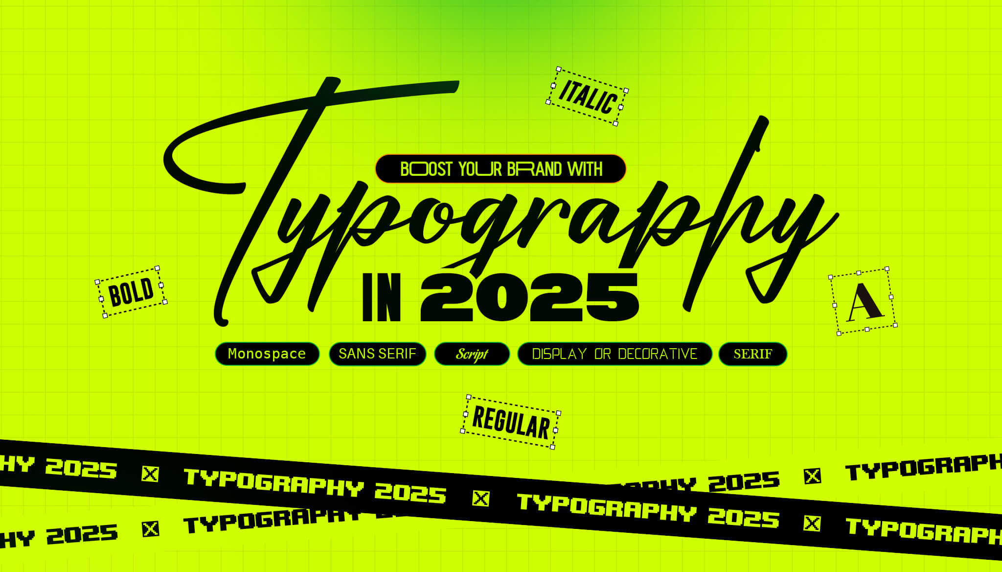
For example, a high-end fashion label using a playful comic-style font wouldn’t feel trustworthy. That’s because certain fonts are tied to certain moods or expectations. Serif fonts, with their small finishing strokes, often feel formal or classic. Sans-serif fonts, on the other hand, come across as clean and modern. Script fonts add elegance or creativity depending on the complexity, while monospace fonts might suggest tech or utilitarian uses.
Typography also affects how easy it is for someone to read and remember your content. If your brand’s typeface is easy on the eyes, uses enough spacing, and stays consistent across platforms, people are more likely to stay and absorb your message. If your text looks messy or inconsistent, readers might disengage.
Maintaining consistency in typography across digital channels like websites, apps, and social platforms helps reinforce brand recognition. Using different fonts or styles too often can weaken the visual identity you’re trying to build. Stick with a defined set of fonts for headings, subheadings, and body text, and apply them the same way throughout. This kind of repetition doesn’t feel boring—it builds recognition.
Picking typography isn’t always about what looks cool. It has to match what your brand stands for and who it’s trying to reach. Getting this right means finding fonts that reflect your business personality and make your message easy to understand.
Here are a few types of typefaces and what they generally suggest:
Once you’ve got a few font options in mind, test them out in real scenarios—on your site’s homepage, in a social media post, or within a digital ad. This helps you see how your typography will live within your brand’s actual environment.
You’ll also want to make sure your chosen fonts are readable across sizes and screens. Just because a font looks good on a laptop doesn’t mean it’ll hold up on a mobile screen. Spacing between letters and lines also plays a big part. Poor spacing can make even the best font hard to read.
Sticking to two or three fonts that work well together keeps your style neat and flexible. One for headers, one for body text, maybe a third for highlights. That balance helps the reader’s eye flow naturally and gives your digital presence a consistent look and feel.
Typography is always changing, and 2025 is shaping up to bring a mix of throwbacks and new directions. Brands are exploring ways to feel more human, while still looking sharp on screens of all sizes. The designs getting the most attention right now are the ones that stand out without trying too hard.
Here are a few standout trends for this year:
A good example is a homeware brand that upgraded its visual language by switching from a standard serif font to a custom geometric sans-serif. The result was a fresher look that matched their updated website design and product packaging. The new type helped simplify their image while making everything easier to read on screens.
While trends can be fun to explore, what matters most is how well they work with your brand voice. If a font trend grabs attention but doesn’t say what your brand stands for, it can cause confusion instead of connection. Balance is key—mix fresh ideas with your core design values to stay consistent.
Design choices like typography are often pushed aside when running a business gets busy. But skipping out on strong, clear type choices can hold back your brand recognition. Even small decisions—like which font goes on your homepage—make a big difference. That’s why working with people who know this stuff inside and out can make things much easier.
A proper graphic design service won’t just pick a pretty font. They think through where the font will live, how customers will interact with it and how it fits your overall brand personality. It all leads to creating a smart, cohesive look. That way, your message stays clear and consistent, no matter where someone sees it—on your site, an app, or a printed product.
With expert input, you’ll also get designs tested for legibility and accessibility. This includes line spacing, colour contrast, text sizes across devices, and how typography pairs with other parts of your visual system. It’s not just about looking good—it’s about being understood easily.
You also save time. Fewer guesswork rounds. No hours lost scrolling through font libraries. A design partner will get you a solution that not only fits but also supports your branding over the long term.
Your typography choices are more than just letters on a screen. They shape how people see your brand, understand your message, and remember your name. When done right, they build trust before anyone even clicks a button.
Consistency helps your brand feel put-together, while good readability keeps people engaged and interested. And when your fonts mirror your personality—whether that’s elegant, bold, minimal, or fun—they make your business easier to recognise and connect with.
Getting typography right isn’t about chasing trends or copying others. It’s about knowing your brand and being thoughtful with your visual choices. That’s where professional help comes in—turning good ideas into clean, strategic design that lasts.
Typography can easily be overlooked, but when treated with care, it becomes one of your strongest recognition tools. Keep it sharp, keep it consistent, and don’t be afraid to make it yours. A strong visual voice might be the thing that sets you apart.
When you’re ready to elevate your brand with thoughtful design, explore how our graphic design service uk can bring your vision to life. At Devmont Digital, we specialise in creating typography solutions that reflect your unique identity and enhance your digital presence. Discover the difference a strategic approach to typography can make.
Keeping an app fresh and running smoothly means updates are part of the regular routine.
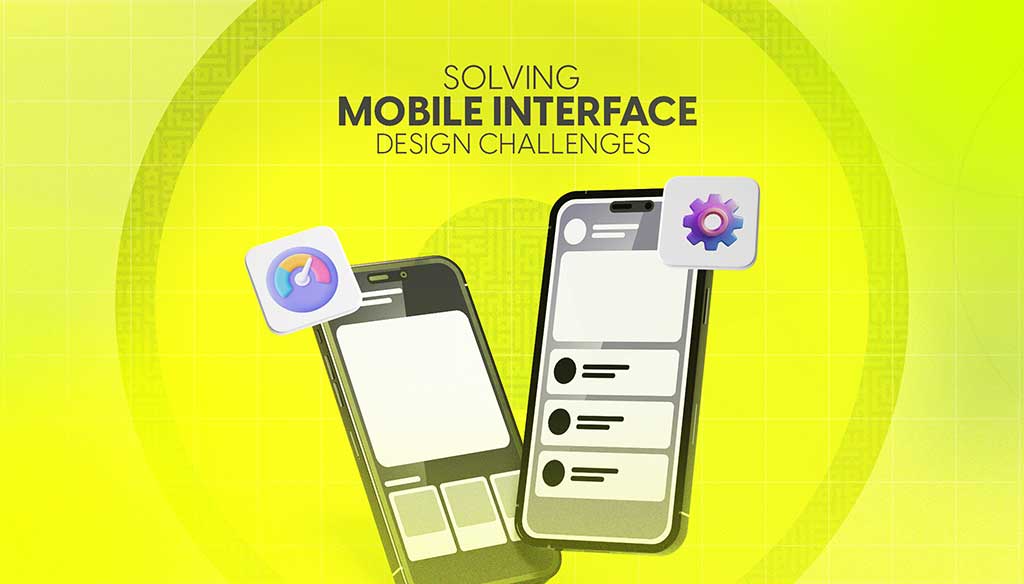
Read moreDesigning for mobile isn’t just about shrinking everything down to fit a smaller screen. It’s about making sure users can move through an app or website with ease, no matter where they are or what device they’re using.
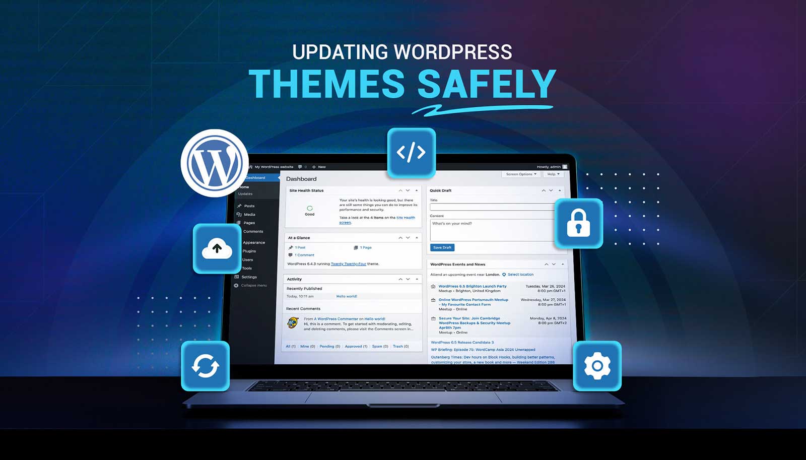
Read moreUpdating a WordPress theme sounds simple, but there’s always that worry it might break something on your site. Whether it's a misaligned button, a missing image, or a full layout shift, one small change can ripple into major issues. That’s why it’s so important to handle theme updates with care. Updates bring new features and repairs, but your site’s performance, design, and layout should stay just as your visitors expect or get even better.
Read more