To new businesses, give you the expertise, approaches, and techniques you should know to be a super hero.
You’ve launched a Google Ads campaign, picked your target audience, and set a decent budget. But the banner ads? They’re getting views and barely any clicks. That drop-off can feel frustrating, especially when you’ve spent time trying to get the design just right. The thing is, clicks don’t happen unless your banner stands out with the right message and visual approach.
Google Ads banners sit in a crowded space, right next to countless other distractions. To grab attention and get someone to actually click takes more than flashy colours and a catchy phrase. It needs clarity, focus, and proper design thinking. If your banners aren’t performing, chances are it comes down to a handful of design missteps that can be fixed without a complete overhaul.
Lots of banner ads miss the mark because of a few common issues. These problems aren’t always easy to catch during the design process, but they become clear once the ad goes live and traffic slows to a crawl. Fixing them starts with knowing what to look out for.
If your banner feels overloaded with too many elements like text, buttons, or visuals, it ends up being hard to read. Your audience scrolls right past it. A busy layout leaves no clear place for the eye to land, and if someone has to work out what the ad is saying, they’ll move on fast.
Unattractive or clashing colour combinations can hurt your ad more than you realise. Neon text on bright red backgrounds or using colours that blend too closely can make the ad frustrating to look at. Some colours may also not appear clearly across different screens or devices.
Phrases like “Click here” or “Get started” don’t mean much if the viewer has no idea what’s in it for them. Without a clear benefit or offer, the copy ends up sounding like every other ad online. Banner space is limited, so every word needs to deliver value or grab attention.
Images that are pixelated, outdated, or irrelevant weaken the entire impression of your brand. The visuals should feel modern, match your offer, and grab attention. If it looks rushed or like clip art from years ago, it likely won’t get noticed.
Let’s take one example: a banner promoting a summer travel deal. If it’s packed with multiple paragraphs of text, features a blurry beachfront photo, and uses a red font on a blue background, it probably won’t get any clicks. Strip it back, use fewer words, pick a crisp image of a sunny destination, and suddenly the ad feels welcoming and easy to interact with.
When banners underperform, it’s rarely because of the ad platform. It usually comes down to design decisions made during creation. Keeping designs clean, copy clear, and visuals sharp goes a long way in improving click-through rates.
After spotting what’s going wrong, let’s look at how to fix it. A strong banner design doesn’t just sit there looking pretty—it pulls attention and steers people toward your offer quickly.
Start with high image quality. Banners with grainy or bland visuals are easy to ignore. Use images or graphics that are sharp, focused, and clearly connect to the message you’re sending. People process visual content faster than text, so give them something strong to process.
Think about colour choice. Colours are powerful tools in any design. Blues can calm, reds create urgency, greens feel fresh. Choose colours that support the message and don’t just fill up empty space. It’s not about choosing bright over dull—it’s about choosing the right mix that makes the elements stand out clearly.
Now, look at the layout of your banner. How everything is placed makes a huge difference. The clearer the layout, the faster someone can understand what the ad is about. White space is helpful here. It creates separation between parts and makes each item easier to follow.
Quick layout tips include:
Remember, design is more than decoration. It’s how you guide someone’s eye to the main offer. A balanced, clean design helps convince them to click without trying too hard.
Even if your design attracts attention, what really drives results is a solid call-to-action or CTA. That’s the part that tells someone what to do next. If the CTA is missing or confusing, nothing else matters as much.
Start with your message. Choose language that guides and encourages action. Avoid words that sound robotic or overused. Instead of saying something like “Learn More”, pick copy that’s tied to your offer like “Claim Your Deal” or “Start Saving Now”.
Good placement is just as important. Look at where a viewer’s eyes will naturally stop. The CTA should be there, not buried behind other text or stuck in the corner. Most often, a bottom-centre or bottom-right spot works well. It matches how people read and gives them an easy way to act.
Pay attention to how the CTA looks:
Think of it like a signpost. The CTA has to be clear about what happens next. When it’s prominent and obvious, it has a higher chance of getting clicked.
Let’s break down what strong banners look like in action. It helps to compare a weak version with one that’s built to perform better.
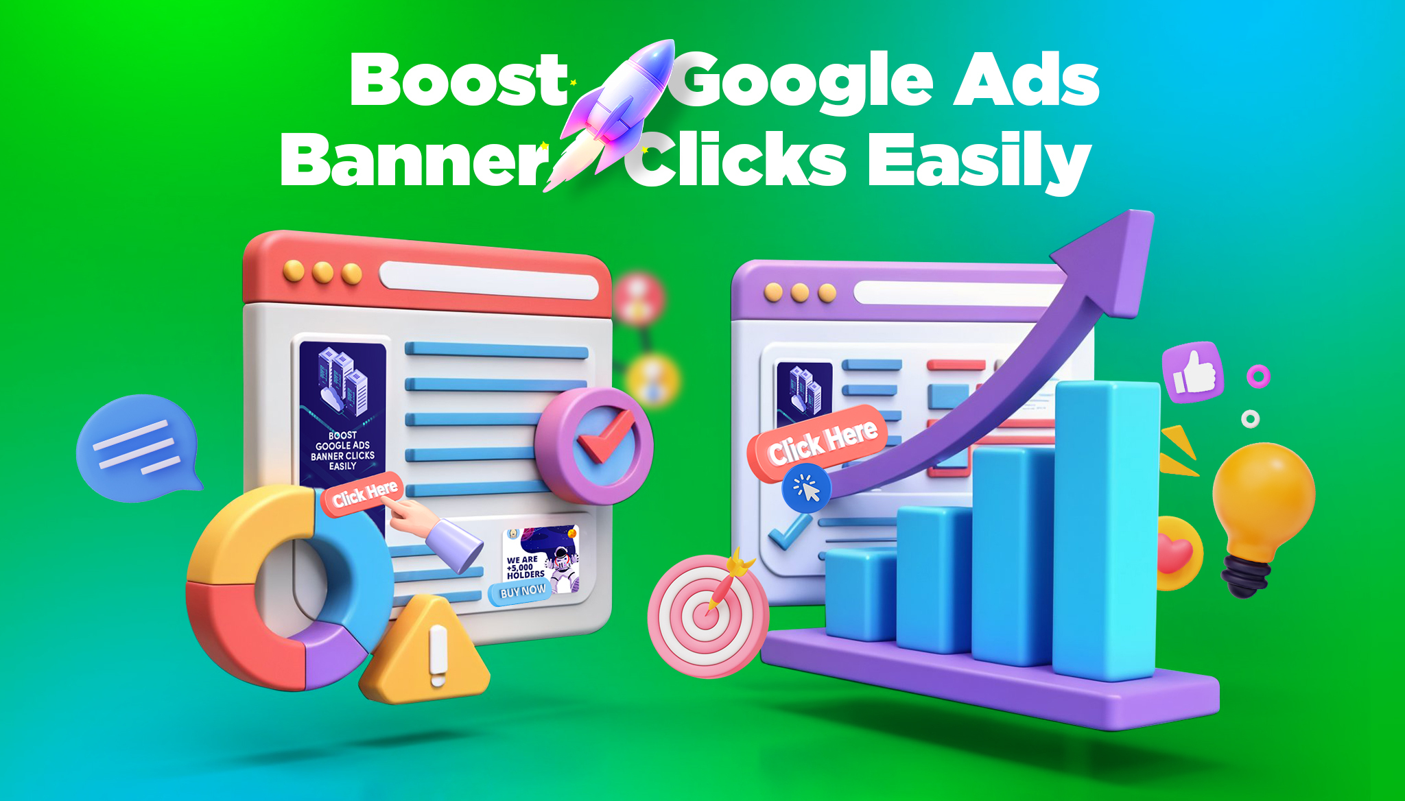
Imagine a home electronics sale banner. The first version tries too hard. It lists several products, uses a fuzzy image of a living room, and splashes two completely different CTAs in different colours. It feels messy and hard to follow.
Now the improved version. This banner focuses on just one main product. It shows a high-quality image with good contrast over a calm grey background. There’s a short and direct headline, such as “Weekend Sale Ends Soon”. The CTA says “Shop Limited Deals”, placed within a bold orange button. The whole thing is quick to understand and nice to look at.
What the strong version does right:
These are all small choices that help make one version far more effective than the other. The more your design focuses on clarity and guiding attention, the better the outcome.
Making Google Ads banners that people actually want to click starts with smarter design decisions. It’s easy to get caught up in trends or overdo things with colours and animations, but often, a simple and direct approach is what works best.
Make sure each part of the design supports the message. Choose graphics that reflect your offer. Keep your layout clean. Let your CTA be the hero of the banner. Each tweak you make should bring the user closer to taking action.
These updates don’t cost much time or money, but they help you gain more from every impression. The next time you create a banner, ask yourself—will this make someone stop and click?
If you’re unsure or want to save time, you don’t have to figure all this out alone. Design that works takes careful thought and the right tools. That’s where our team at Devmont Digital comes in.
Make your banners work for you by refining their design to boost engagement. If you want to transform your ad strategy, our services can guide you to success. Discover how we excel in google ads banner design and see how Devmont Digital can help you make every click count.
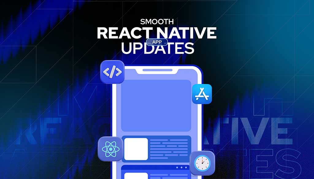
Keeping an app fresh and running smoothly means updates are part of the regular routine.
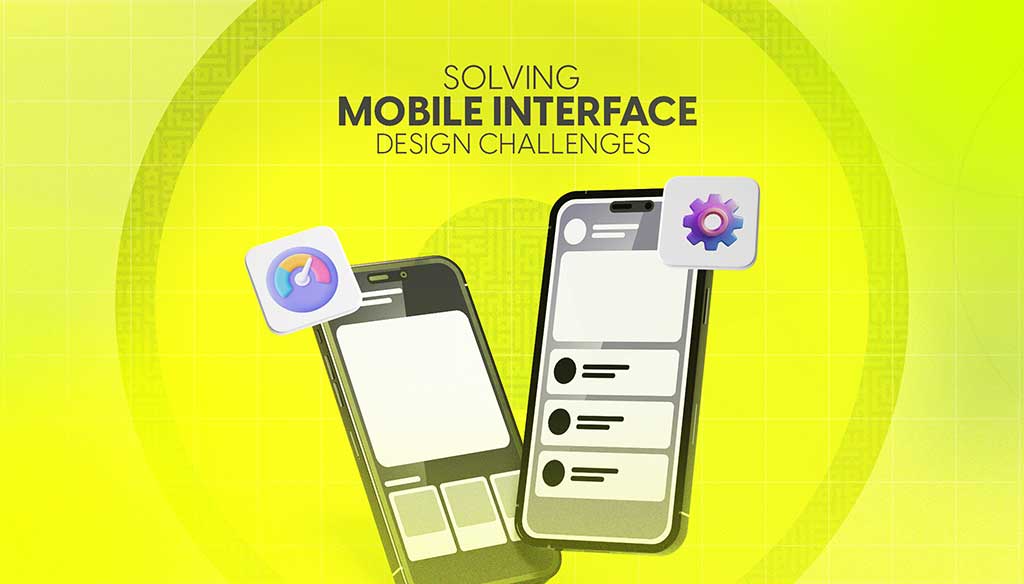
Read moreDesigning for mobile isn’t just about shrinking everything down to fit a smaller screen. It’s about making sure users can move through an app or website with ease, no matter where they are or what device they’re using.
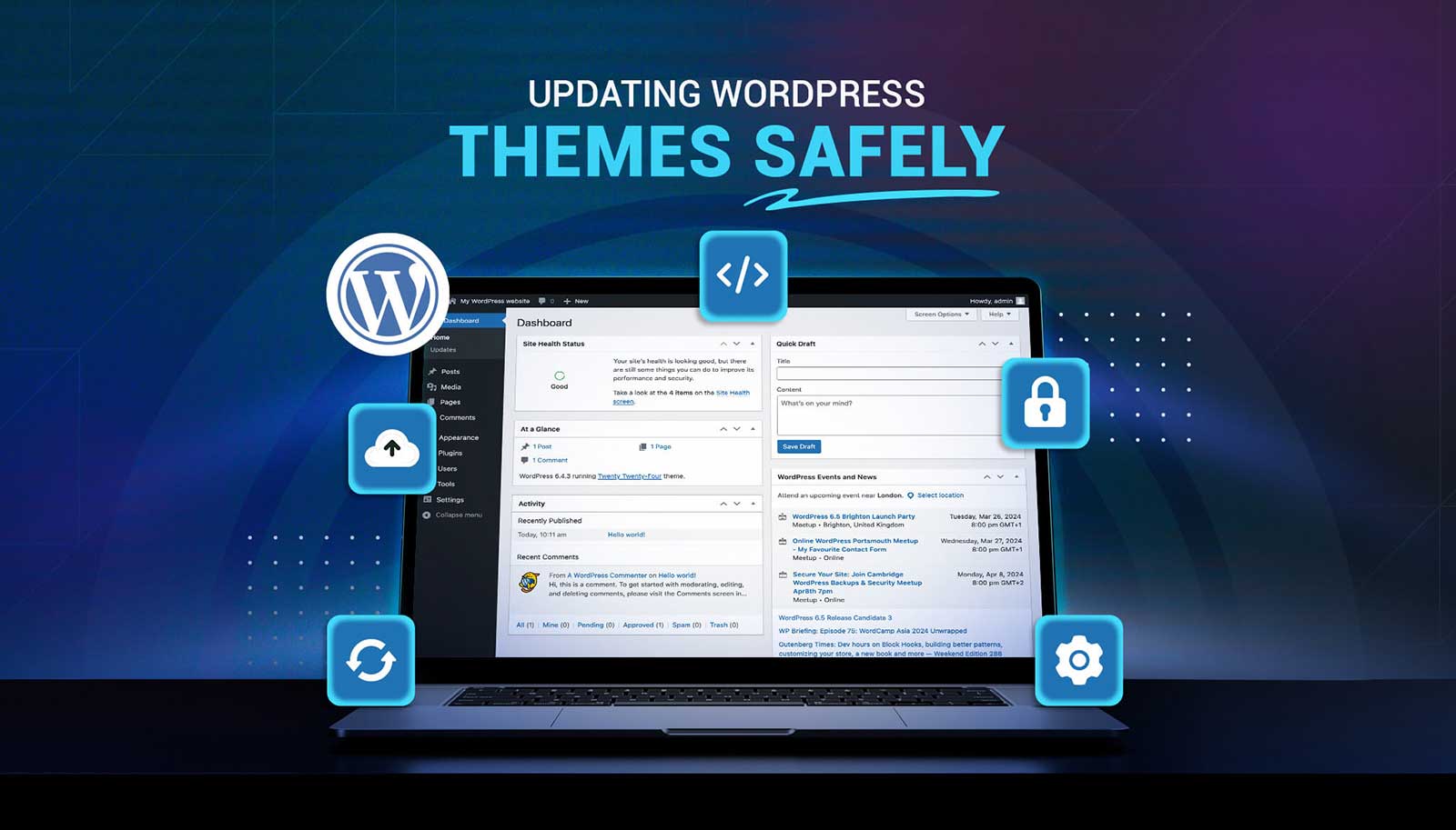
Read moreUpdating a WordPress theme sounds simple, but there’s always that worry it might break something on your site. Whether it's a misaligned button, a missing image, or a full layout shift, one small change can ripple into major issues. That’s why it’s so important to handle theme updates with care. Updates bring new features and repairs, but your site’s performance, design, and layout should stay just as your visitors expect or get even better.
Read more