 +44 753 718 3990
  hello@devmontdigital.io
To new businesses, give you the expertise, approaches, and techniques you should know to be a super hero.
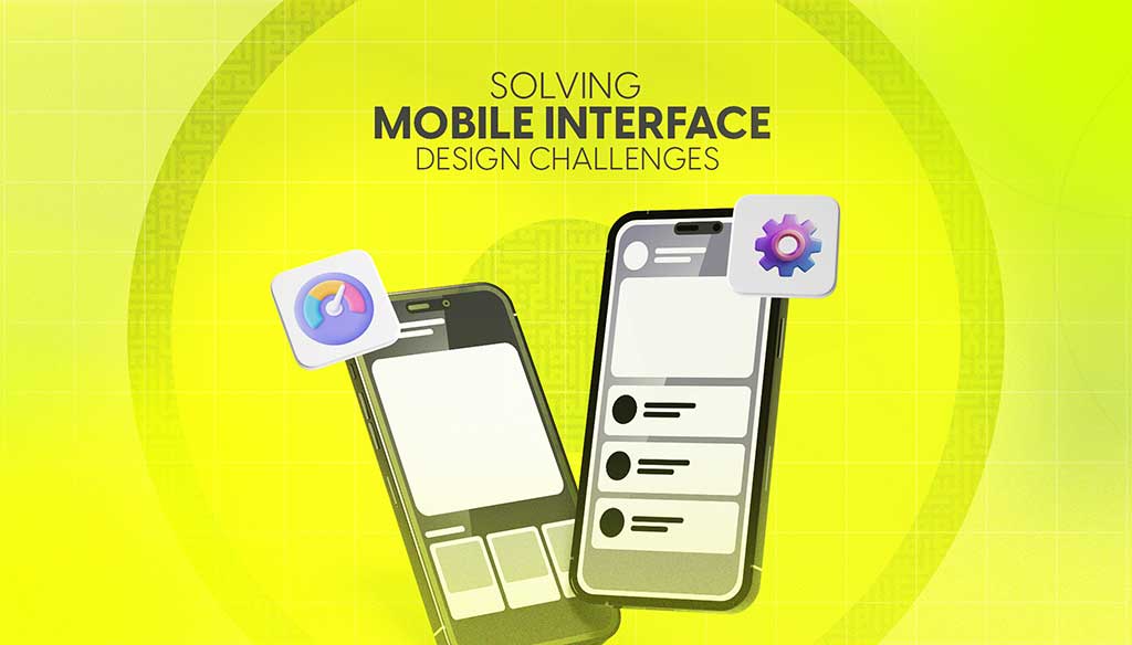
Designing for mobile isn’t just about shrinking everything down to fit a smaller screen. It’s about making sure users can move through an app or website with ease, no matter where they are or what device they’re using. The expectations for mobile experiences keep getting higher, and even small design issues can turn people away quickly. This means that solving mobile interface challenges isn’t a bonus — it’s a must.
Common issues like confusing layouts, slow response times, or buttons being too close together crop up more often than you’d think. These problems may seem small, but they can turn your site or app into something frustrating rather than helpful. A good UI design agency knows how to catch these problems early and solve them with a mix of solid planning and smart design choices.
When people open an app on their phone, they expect it to work without a second thought. Taps should lead somewhere, buttons should be easy to find, and it shouldn’t feel like a puzzle just to get what they need. Users have a mental image of how apps should behave, and anytime your design strays too far from that, it can cause confusion or even drive people away.
Some of the most common expectations people bring into a mobile experience include:
If your mobile design clashes with these expectations, users might give up before they ever finish a task. For example, if someone’s trying to book a train ticket in your app and the form loads lowly, or the next button is hidden in a scroll, frustration starts to build. The smoother the experience, the more likely they are to stick around and come back.
A good design takes account of what users want from the first sketch. It doesn’t mean copying what others are doing but working within the framework users are already comfortable with. Keep it clean, responsive, and easy to navigate, and you’re already on the right path.
If people can’t figure out how to move through your mobile app or site quickly, they’ll likely leave without doing what they came for. Navigation builds the roadmap for your users. When it’s done right, tasks feel simple. When it’s messy or unclear, users wind up lost, annoyed, or stuck clicking random buttons.
Common mobile navigation challenges include:
Here’s how you can clean things up and make your mobile interface easier to use:
Great navigation works behind the scenes. Users won’t notice it if everything’s working smoothly, which is the goal. The fewer decisions users have to make to get where they’re going, the better their experience will be. Think of it like a well-designed train station. Clear signs, obvious routes, and no guesswork make all the difference.
Visual clutter makes users pause. When a mobile interface is packed with too many styles, colours, or uneven elements, it becomes hard to follow. People rely on subtle visual cues to understand function. A button should look tappable, text should be easy to scan, and icons should signal a clear meaning. When this balance is off, users waste time trying to figure out what’s going on.
One of the biggest mistakes in mobile design is inconsistency. This might show up as multiple button styles across different screens or inconsistent spacing between elements. These details might seem small, but they affect trust. When an app or site looks polished and predictable, it feels more reliable.
Here are a few ways to keep things clear and consistent:
Think about something as simple as a flight booking screen. If the Book Now button changes colour or shifts size across pages, users might wonder if it’s the same action. Keeping things uniform cuts down on hesitation and makes the interface easier to trust.
Not every user has the same screen. Some will be on a high-end smartphone, others on an older Android device, or maybe even a compact tablet. Your mobile interface has to behave well on all of them. The layout should stretch or shrink gracefully, without bits falling off the edge or getting jumbled together.
This is where responsive design comes in. It’s about building layouts that react to the screen size they’re being shown on. But that doesn’t mean scaling the same layout up or down. It means adjusting proportions, reflowing content, and possibly even hiding or condensing certain parts to keep things user-friendly.
To handle this smoothly:
The goal is for every screen size to feel natural. No awkward zooming. No cut-off content. Just a layout that adjusts itself so users can get stuff done without bumps.
You’ve got the structure. Now it needs life. A mobile interface that feels dry or flat probably won’t hold attention. But going too far with flashy effects or pop-up elements can annoy users even
faster. Engagement needs balance.
Users appreciate small touches and tidy surprises, like a satisfying button animation or a subtle sound cue when a task is completed. These details create a smooth and enjoyable feel. But overdoing interaction can distract from what matters most, getting things done quickly and clearly.
Some helpful ways to build engagement without getting in the user’s way:
Picture an app that helps you track habits. Instead of just marking a task as done with a tick, it gives a smooth animation and a short line of friendly feedback. It takes half a second, but it improves how the user feels. That’s thoughtful design at work, steady, not overwhelming.
Designing mobile interfaces isn’t just about making things look tidy. It’s about meeting users where they are and giving them tools that work the first time, every time. Comfort, ease, and confidence should be part of every tap, swipe, and scroll.
Getting this right means digging into the details. From user needs and expectations to screen sizes and feedback loops, each part plays a role. When these pieces all line up, the interface disappears and the experience takes over. That’s when design really works, when it just feels right.
To create a seamless mobile user experience, tapping into expertise is key. If you’re looking for guidance on refining your digital presence, explore how our ui design agency can help. Devmont Digital offers tailored strategies and solutions to ensure your app or website is not only functional but also engaging and intuitive for users. Let’s work together to make every interaction count.
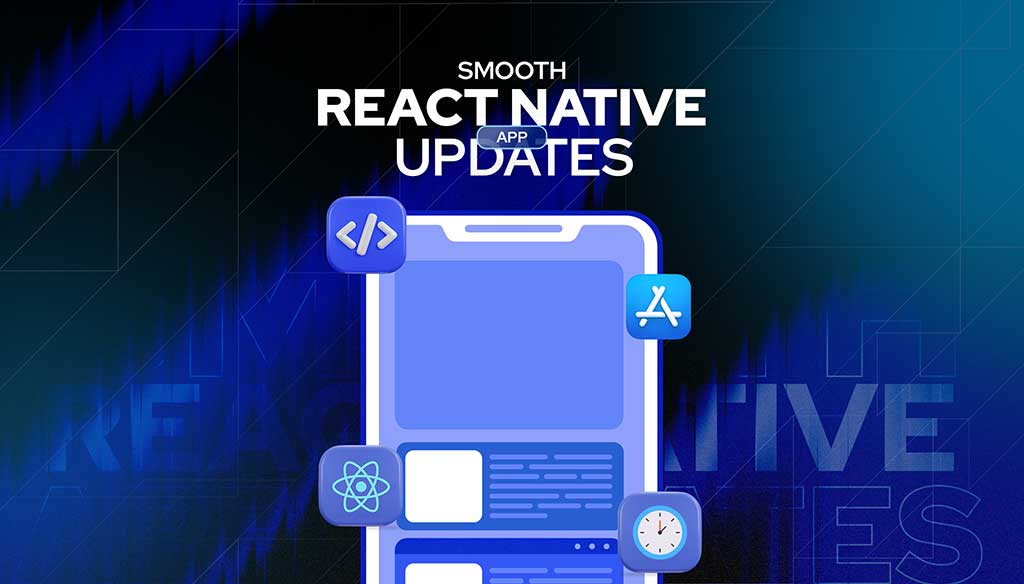
Keeping an app fresh and running smoothly means updates are part of the regular routine.
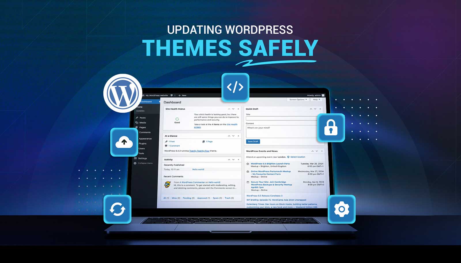
Read moreUpdating a WordPress theme sounds simple, but there’s always that worry it might break something on your site. Whether it's a misaligned button, a missing image, or a full layout shift, one small change can ripple into major issues. That’s why it’s so important to handle theme updates with care. Updates bring new features and repairs, but your site’s performance, design, and layout should stay just as your visitors expect or get even better.
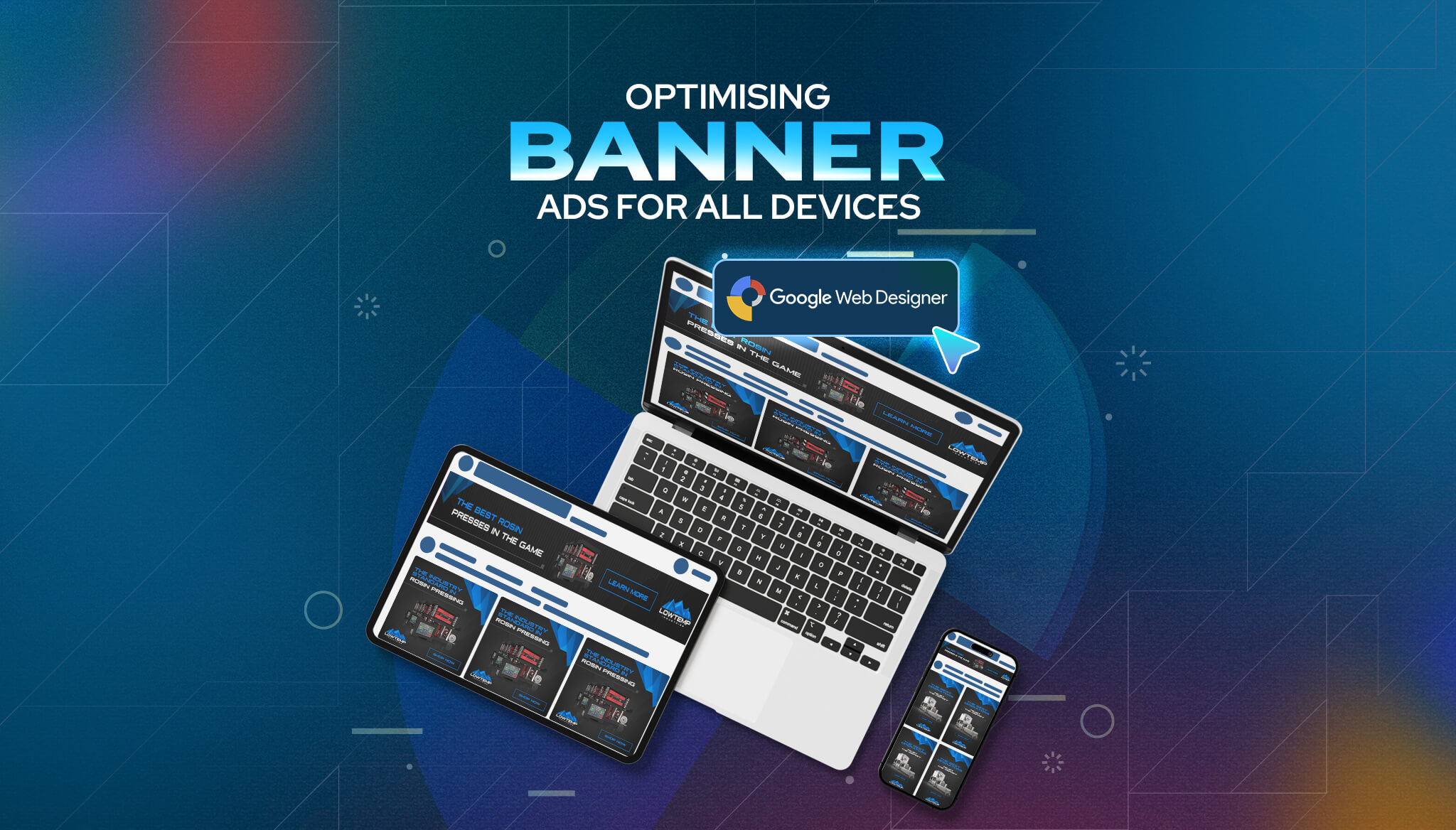
Read moreBanner ads are everywhere. You’ll spot them at the top of websites, tucked into blog sidebars, or floating across news articles. They’re a common way to grab someone’s attention and drive clicks, but their impact really depends on how well they’re made. A strong banner ad can draw people in. A clunky and hard-to-read one will just get ignored.
Read more