 +44 753 718 3990
  hello@devmontdigital.io
To new businesses, give you the expertise, approaches, and techniques you should know to be a super hero.
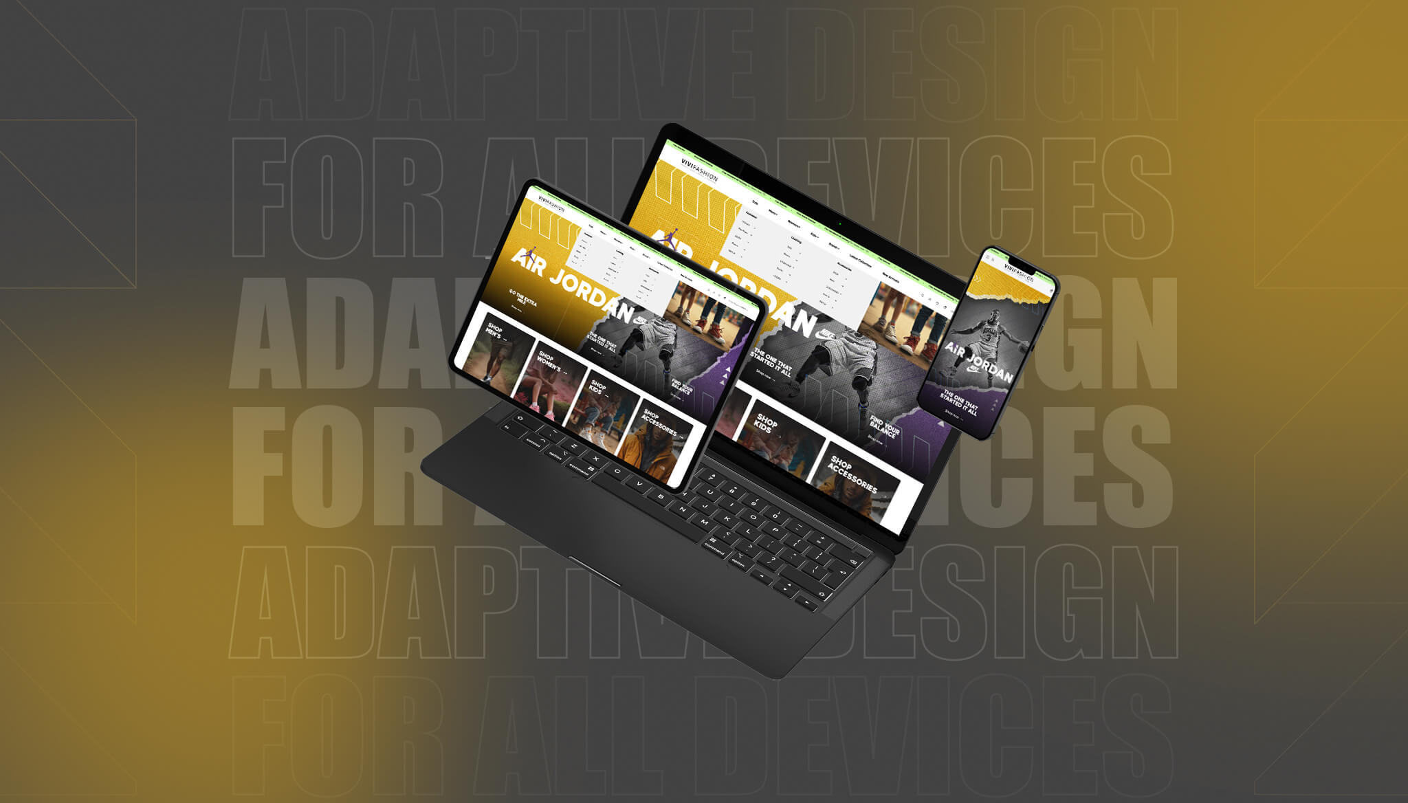
Screens come in all shapes and sizes now. From big office monitors to slim smartphones and tablets, people switch between devices without giving it much thought. That means your website has to do the hard work, adjusting smoothly, loading quickly, and looking right, no matter what screen it’s on. If it doesn’t, users might leave before they even get started. That’s where having a strong adaptive design isn’t just helpful, it’s expected.
Too often, sites are built around one or two screen types and struggle on others. Adaptive design takes a different approach. Instead of stretching or shrinking everything in the same way, it tailors layouts and content for each kind of device. It’s more thoughtful, more flexible, and built to meet users where they are. Whether someone’s browsing on their phone between meetings or checking out your services from their desktop at home, they’ll get an experience that feels natural to them.
Devmont Digital offers design support that covers this need. As a responsive web design agency, we craft experiences that feel smooth and right no matter what someone is using to browse your site.
Adaptive design is all about flexibility with purpose. It focuses on delivering layouts that are built ahead of time for specific screen sizes. So rather than one layout squeezing itself into every device type, adaptive design reacts intelligently. It figures out what device is being used and loads a layout that suits that screen best.
Some people confuse this with responsive design, and that’s easy to do. While both aim to make websites work across different devices, the way they do it is different. Responsive design relies on a single layout that shifts and stretches to fit the space it’s given. Adaptive design, on the other hand, uses multiple fixed layouts and picks the most suitable one based on the device size. Think of it like packing different lunchboxes for different people, rather than stretching one sandwich to feed three.
Here’s why adaptive design makes sense for businesses today:
Let’s say you’re running an online service platform. Someone visiting from a large desktop monitor might see a full dashboard and multiple side tools right away, but someone on a mobile might only see a simplified version with core actions to avoid clutter. Adaptive design allows you to make these decisions upfront, so each user gets what they need, not what they don’t.
Adaptive design helps keep your site fast, clean, and clear, no matter whose screen it ends up on.
Getting adaptive design right isn’t about just thinking small or big. It’s about making each version of your site work well for the screen it shows up on. There are a few key pieces that need to come together to make that happen.
Adaptive design uses breakpoints, which are screen widths that trigger different versions of your layout. These aren’t random sizes. They’re based on actual device widths that people use, like popular smartphone, tablet, and laptop screen sizes. Planning breakpoints properly helps make sure your content lands exactly where you want it
Not every bit of content needs to show on every device. Small screens don’t need the same level of detail that a desktop layout might support. Adaptive design lets you pick what’s important for each view.
For example:
Images that look sharp on a big screen might take ages to load on a mobile, or worse, show up broken. With adaptive design, you can load smaller, faster versions for small screens and rich, high-resolution ones where there’s room and time for them
Each version of your site loads only what it needs. That keeps it snappy and trim, especially helpful for users relying on slower mobile connections. Pre-built layouts mean less adjusting on the fly and more time spent browsing.
By having control over what each layout looks like and which content shows, adaptive design makes your website more manageable, gives users a better experience, and cuts down on wasted load time. It’s a practical way to build a digital presence that doesn’t leave users pinching, zooming, or squinting to get things done.
Before starting the design work, planning and research are key. Start by understanding who’s visiting your site and how they’re accessing it. Are most of your users on mobile devices? Do a significant number still use large monitors at work? Collect this data through analytics tools and surveys. Having a good grasp of common screen sizes used by your audience will help reduce guesswork and ensure your breakpoints are well chosen.
Once you know your audience, move on to mapping out layouts for each screen size. Focus on the experience you want to provide on each device. Small screens might need bigger buttons and shorter content, while desktops give you more room for details, images, and extra tools. Creating wireframes for each device type helps teams visualise what users will actually see and interact with. These drafts also help spot any gaps or overlaps in usability between versions. Testing your adaptive layouts is just as important as building them. You can’t rely on theory alone when it comes to something as variable as device behaviour. Here’s a quick approach to help refine your site:
Keep notes of what works and what doesn’t during testing. Over time, this will speed things up and give each round of updates a foundation to build from. The point isn’t perfection, it’s progress. Adaptive design helps you meet people where they are, but consistent checks make sure you’re keeping up with what they actually need.
Creating strong web design isn’t just about what looks appealing. It’s about making sure it functions well across a range of devices, even as those devices continue to change. Trying to handle all of this in-house can stretch internal teams, especially if they don’t specialise in design or front-end development.
Working with a responsive web design agency can take a lot of the pressure off. These teams know which devices are common, what different browsers do to your site, and how design choices affect load time and user flow. That experience means fewer testing errors and less time wasted fixing issues once a site is live.
Budget plays a role too. Scaling design for every screen type while managing images, content blocks, and menus for each version can cost more if handled inefficiently. Agencies that deal with this type of work every day often already have tested processes that save time. This leaves your team free to focus on your business while someone else handles the design side.
Another plus of working with expert teams is consistency. Once your layouts are set up to match each screen size, agencies can maintain them as tech evolves. That way, you won’t need to worry about rebuilding your site every time a new phone model comes out or a browser updates. They’ll watch performance and test changes before they create problems, keeping your site stable through updates.
Imagine launching a new service page. An agency can test how that page looks and functions on a small-screen phone, a mid-size tablet, and a widescreen desktop. They can find layout inconsistencies you might miss and smooth the content flow so it’s easy to explore across devices. This kind of support strengthens your website and ensures users enjoy a friendly experience no matter how they arrive at your content.
When you have the right people looking after your layouts, adaptive design shifts from being a major task to a planned part of your digital growth.
Building a website that adapts well to any screen isn’t just smart, it’s how users expect things to work. With adaptive design, you can show your content clearly, make every interaction easier, and shape a digital space that suits different browsing needs.
Backed by experience as a responsive web design agency, Devmont Digital is here to help you move forward. Whether it’s mapping new layouts or refining what you already have, we bring the structure and strategy that makes adaptive design easier to manage and more effective for your users.
If you’re looking to create a site that adjusts easily to any screen size, Devmont Digital can help make that happen. As a responsive web design agency, we build flexible layouts that work smoothly across phones, tablets and desktops. Let’s make it easier for your users to connect with your content, whatever device they’re on.
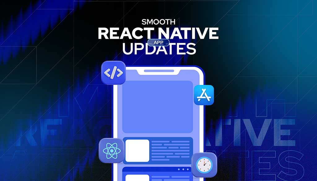
Keeping an app fresh and running smoothly means updates are part of the regular routine.
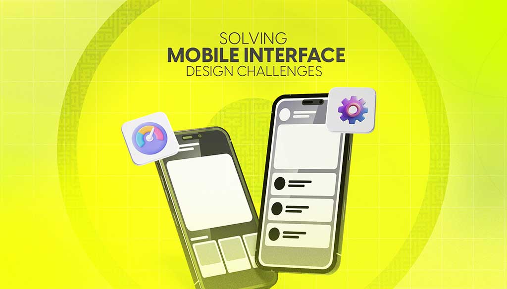
Read moreDesigning for mobile isn’t just about shrinking everything down to fit a smaller screen. It’s about making sure users can move through an app or website with ease, no matter where they are or what device they’re using.
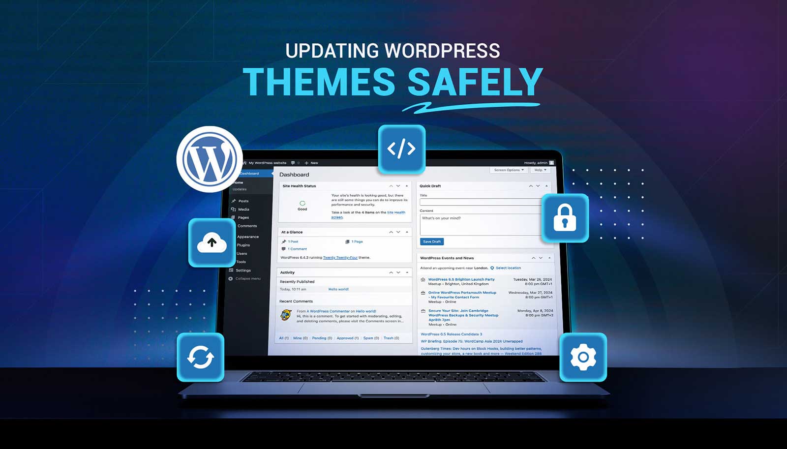
Read moreUpdating a WordPress theme sounds simple, but there’s always that worry it might break something on your site. Whether it's a misaligned button, a missing image, or a full layout shift, one small change can ripple into major issues. That’s why it’s so important to handle theme updates with care. Updates bring new features and repairs, but your site’s performance, design, and layout should stay just as your visitors expect or get even better.
Read more