 +44 753 718 3990
  hello@devmontdigital.io
To new businesses, give you the expertise, approaches, and techniques you should know to be a super hero.
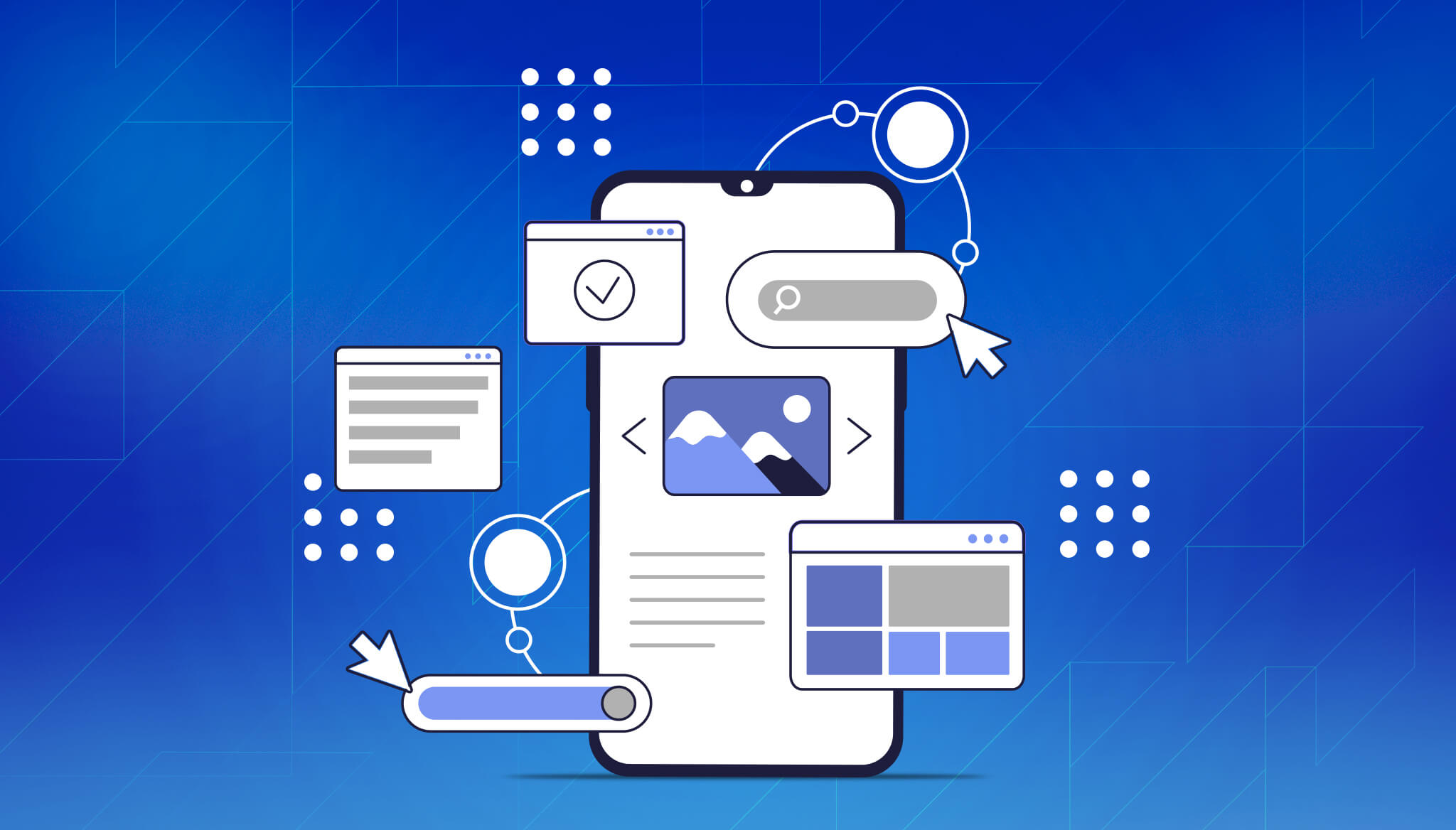
People expect websites to work just as smoothly on their phone as they do on a desktop. Whether they’re shopping, booking an appointment, or just browsing, a slow or clunky mobile experience can cause them to drop off quickly. That’s where mobile-first design comes into play. It puts the needs of mobile users at the centre of the design process from the very beginning. With more people turning to mobile phones and tablets to access websites, building with a mobile-first mindset means better experiences, fewer bounces, and more conversions.
Mobile-first design isn’t just good for users. It also helps your site get noticed by search engines. Platforms like Google prioritise websites that perform well on mobile devices, and a smooth mobile experience can directly boost your ranking. By improving structure, speed, and ease of use on smaller screens, your site becomes more accessible and a lot more useful to visitors. A strong mobile-first approach gives you a better chance of showing up on page one while also building trust with the people using your site.
Mobile-first design is exactly what it sounds like—creating and structuring your website for mobile screens before adjusting it for larger ones like tablets or desktops. Instead of squeezing a full-sized page down into a tiny screen, you start small, focusing only on the most important features. This way, the website stays fast, clean, and simple no matter which device your audience is using.
Starting with mobile helps you trim the fat. You’re not relying on flashy extras to communicate your message. Instead, every element has a purpose. That means your page is quick to load and works well even on slower networks. Compared to tacking mobile adjustments onto a desktop site as an afterthought, this method feels more natural and streamlined. It’s easier to grow a layout that works well everywhere when you begin with a solid mobile-friendly foundation.
The advantages go beyond screen size. Getting mobile-first right can make your business more approachable and credible. People enjoy being able to tap quickly through simple menus, see images that fit their screen without sliding around, and scroll through content without needing to zoom. Just think of how frustrating it is when buttons are too tiny or the page takes forever to load. With mobile-first design, those common issues are avoided from the start.
Designing for mobile use means thinking about how people interact with your website in their hands rather than at a desk. That shift changes how you should build. Here are some of the most important things to factor in:
Even making a few of these adjustments can improve your overall user experience. For example, a clothing store with a streamlined mobile design might let users quickly browse categories, view large product images, and check out with just a few taps. That kind of site removes friction and keeps people coming back. Mobile-first isn’t about adding more, it’s about making what you have work better on the go.
Search engines reward mobile-friendly websites, and that’s not a trend—it’s more like the standard now. If your site doesn’t work well on a phone, it’s pushed down in search listings. That matters because showing up near the top increases the chances of getting clicks. So, the better your mobile experience, the more likely people are to find you in the first place.
Speed plays a big role here. Slow-loading mobile sites frustrate users, which leads them to leave quickly. That bounce sends signals to search engines that users aren’t satisfied with the experience. On the other hand, a page that loads quickly keeps people engaged longer and makes them more likely to keep exploring. Keeping your code clean, compressing files, and cutting back on unnecessary elements will help your site load more smoothly for mobile visitors.
But responsiveness matters just as much. A responsive layout means the website reshapes to fit whatever device someone’s using, whether it’s a phone, tablet, or laptop. Rather than building several versions of a site, a responsive approach ensures everything fits neatly with just one build. It removes the need for zooming, horizontal scrolling, or turning your phone sideways just to get the navigation bar to show up.
If you’re thinking about long-term results, having support from a responsive web design agency can make your life easier. They bring structure and strategy to your layout and help you avoid mistakes that could lower your ranking. The right approach blends technical skill with user-focused decisions, putting both people and algorithms on your side.
Designing for a smaller screen first might sound simple, but balancing user needs and performance takes planning. That’s where partnering with people who design responsive and mobile-first websites for many types of businesses can help. A reliable team pays attention to device behaviours, adjusts spacing for mobile taps, and picks typefaces that actually read well on small screens.
Here’s what to expect when working with experienced designers who know mobile-first layout best practices:
Taking mobile-first seriously has become one of the most important parts of building a strong digital presence. One example is an independent travel business that saw a major jump in lead submissions after restructuring their homepage to perform better on small screens. They had previously focused on desktop, but once the mobile layout was sorted with clearer icons, snappier images, and shorter forms, the whole journey felt less like a chore.
Thinking mobile-first is about meeting your visitors where they are. It means your site loads quicker, feels easier to use, and sends the right signals to search engines. Whether you’re running an e-commerce shop, a service website, or something else entirely, your users expect a smooth experience from wherever they’re browsing. Mobile-first design gets that foundation in place.
Search engines have made their preference clear, and there’s no going backwards. A clean layout, fast page loads, and properly sized content all contribute to better rankings. But the real bonus is that people will want to stick around, explore, and trust you faster if your site simply works well from the start.
When you’re ready to build your site around how visitors actually use it, a mobile-first plan offers a smart and future-proof way forward. Thinking ahead on design today gives your site the lift it needs to reach more people tomorrow. It’s worth the effort to get it right.
If your current site feels outdated or difficult to use on a phone, it might be the right time to rethink your approach. Working with a responsive web design agency can help you create a site that looks and works great on every screen. At Devmont Digital, we focus on building websites that are clean, fast, and easy to navigate, so your visitors stay longer and come back more often.
Keeping an app fresh and running smoothly means updates are part of the regular routine.
Read moreDesigning for mobile isn’t just about shrinking everything down to fit a smaller screen. It’s about making sure users can move through an app or website with ease, no matter where they are or what device they’re using.
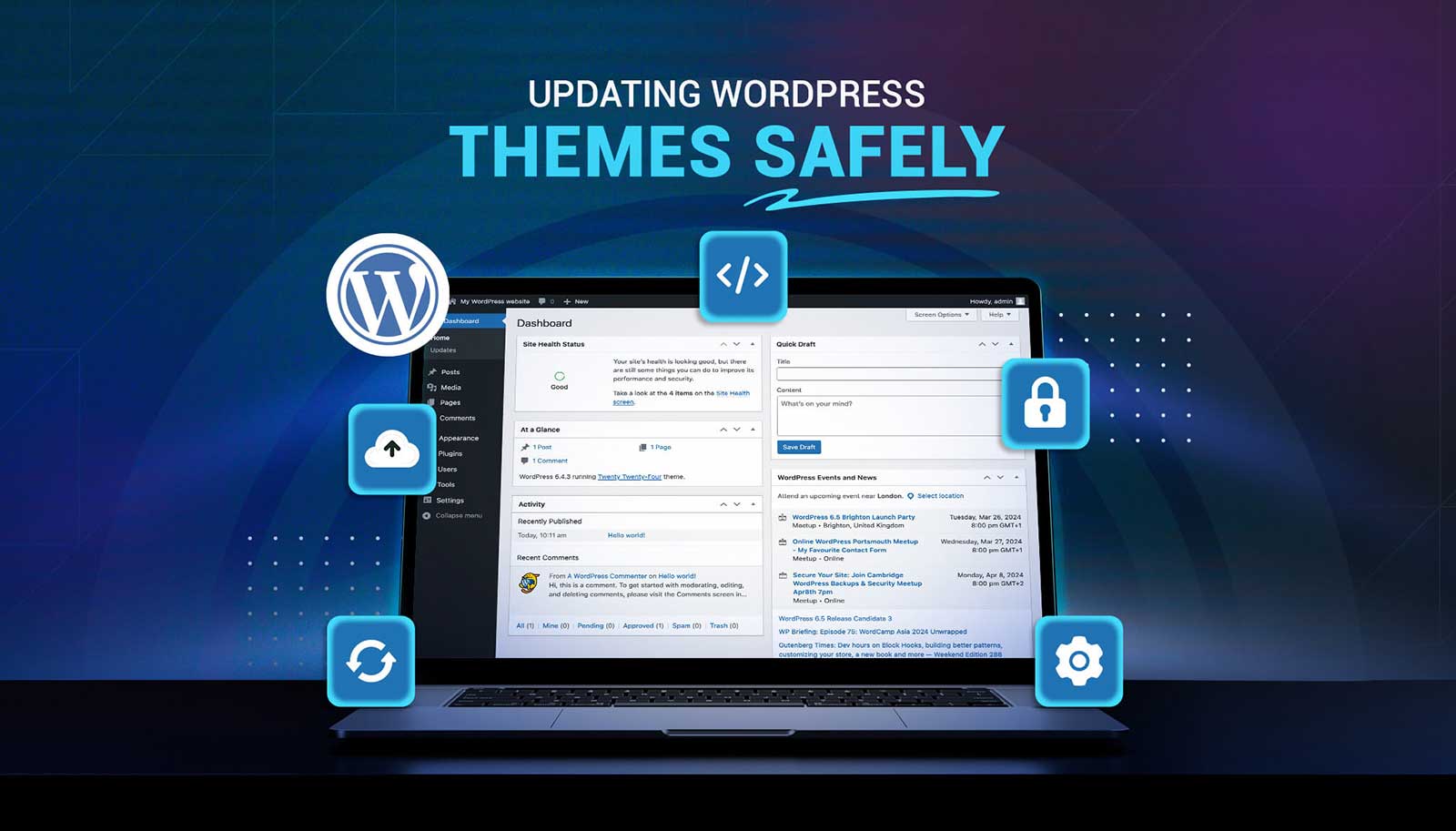
Read moreUpdating a WordPress theme sounds simple, but there’s always that worry it might break something on your site. Whether it's a misaligned button, a missing image, or a full layout shift, one small change can ripple into major issues. That’s why it’s so important to handle theme updates with care. Updates bring new features and repairs, but your site’s performance, design, and layout should stay just as your visitors expect or get even better.
Read more


